 Bear Liu
Overview
MovesMethod is a fast-growing fitness and mobility brand with a community of 202K members, expanding into a dedicated iOS app.
When I joined the project, the app had already been built. A previous designer had delivered the UI. The engineering team had written working code. But after months of work, the product still couldn't launch.
I came in as a Fractional Design Partner, responsible for product direction, design systems, UX strategy, and getting this app from “engineering complete” to the App Store.
- Stalled to App Store
- 3 months
- Community
- 202K
- Native iOS design system
- 0 → 1
Five side-by-side changes
Side-by-side comparisons. The full scope of change in 15 seconds.
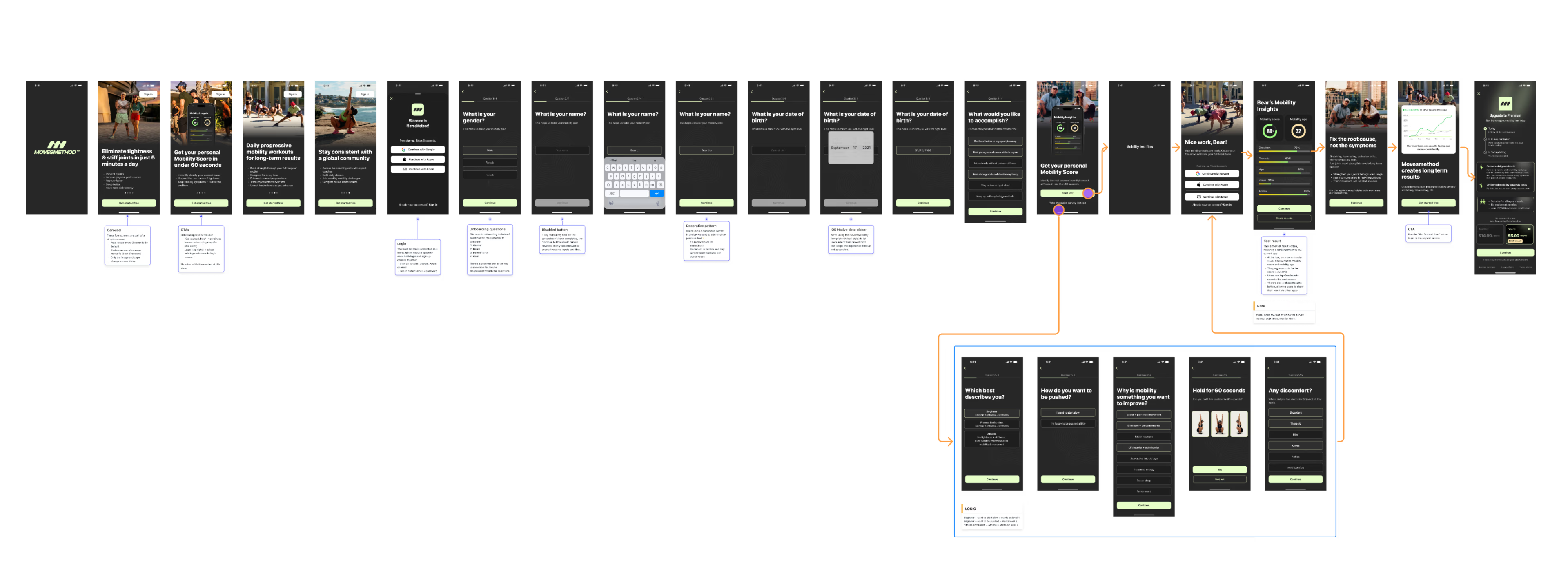
Onboarding
19 steps mixing setup, marketing surveys, and a premature rating request, all before the user sees any value.
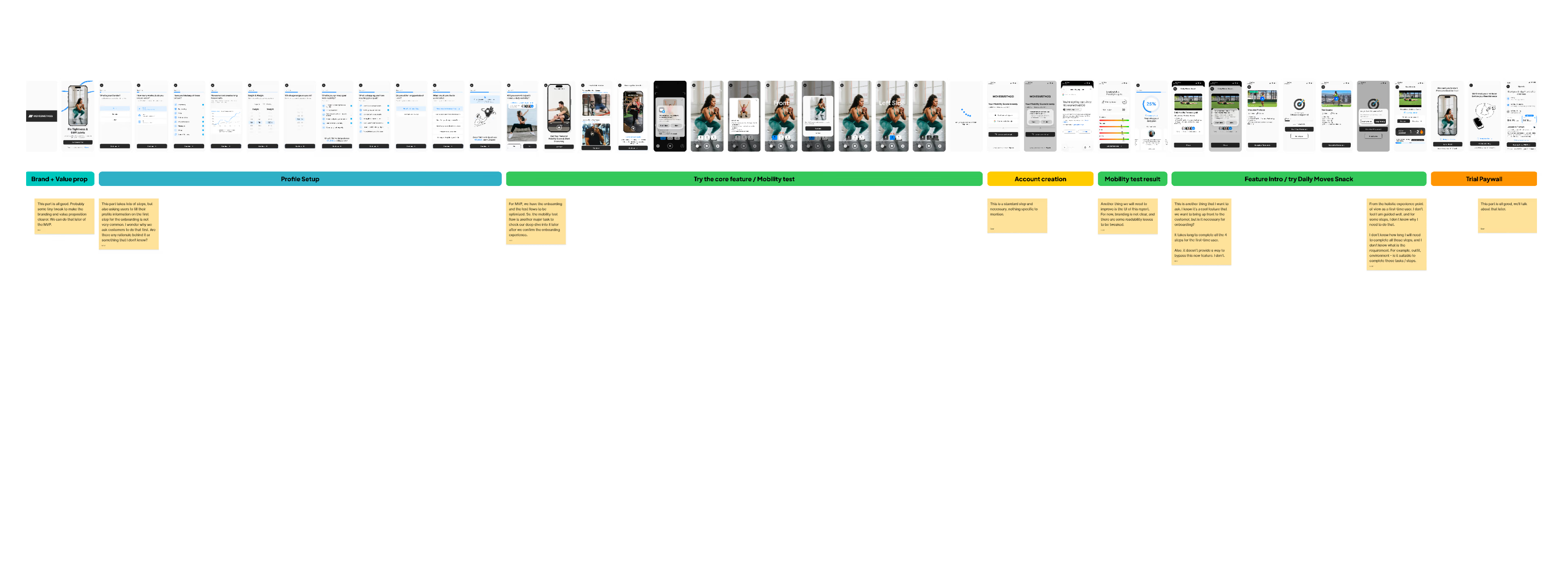
Streamlined flow: Profile → Goals → Plan. Low-value steps moved to post-activation surfaces.
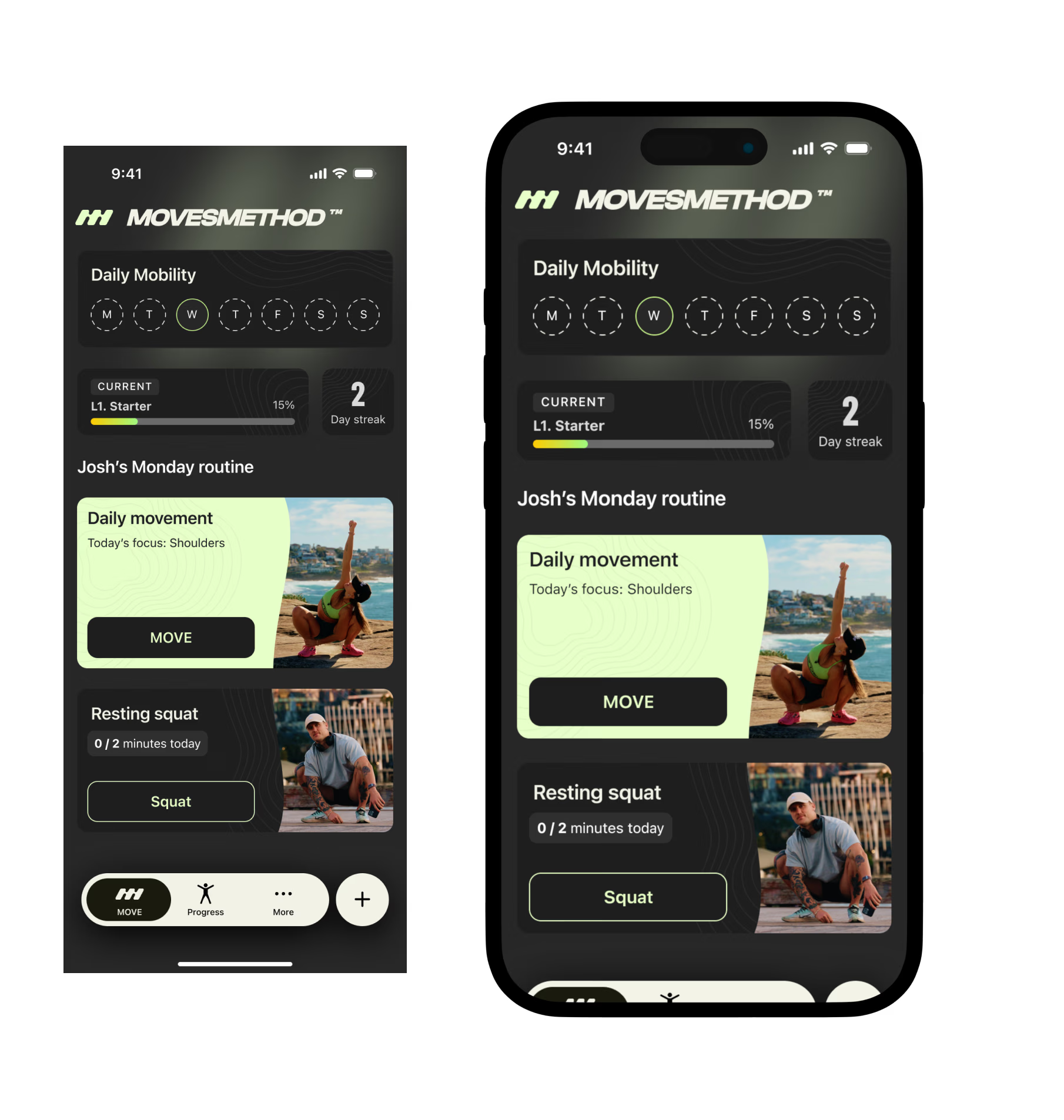
Information architecture
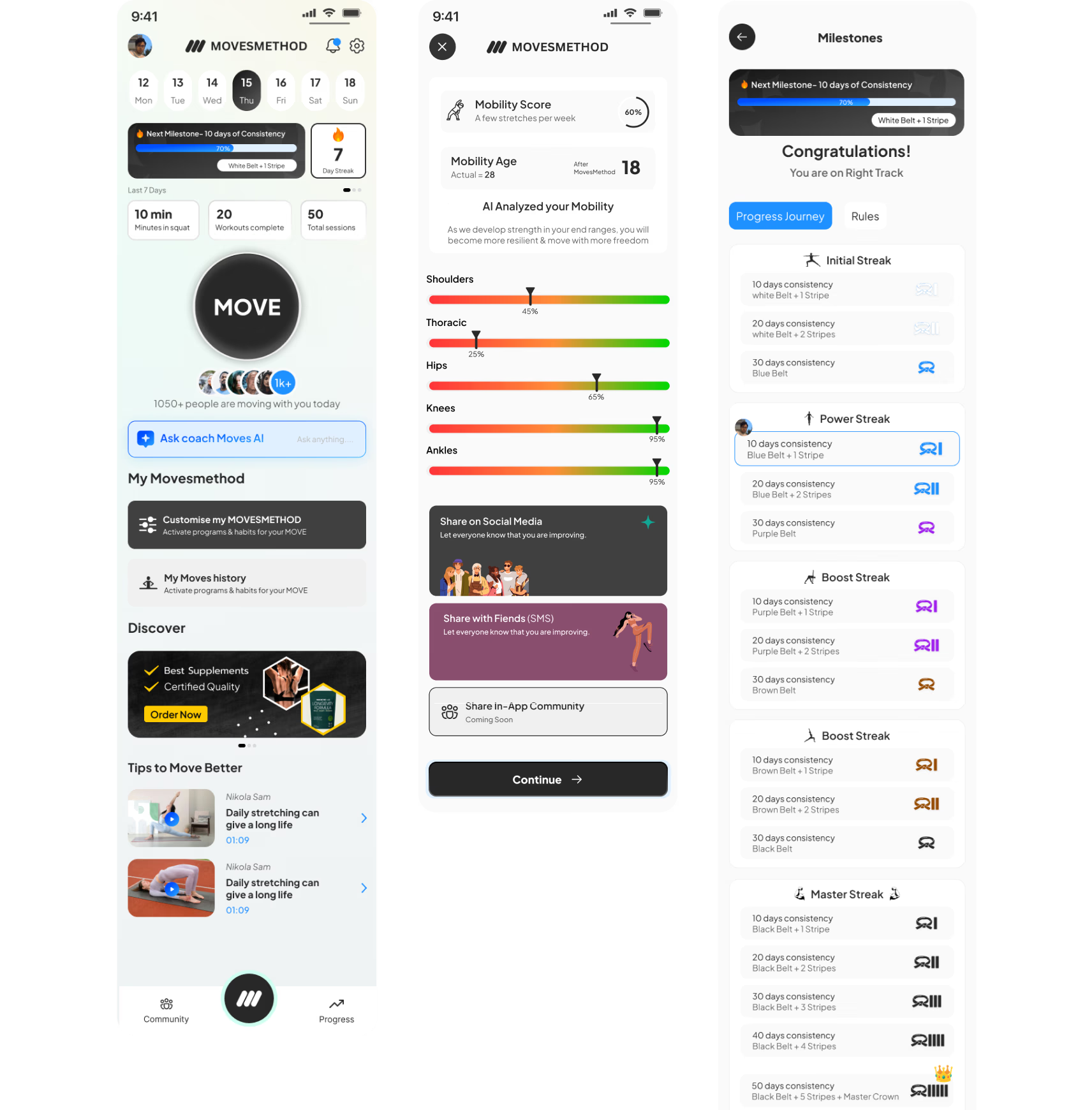
Dashboard crammed with features, promotions, AI chat, social content, and settings on a single surface. No hierarchy.
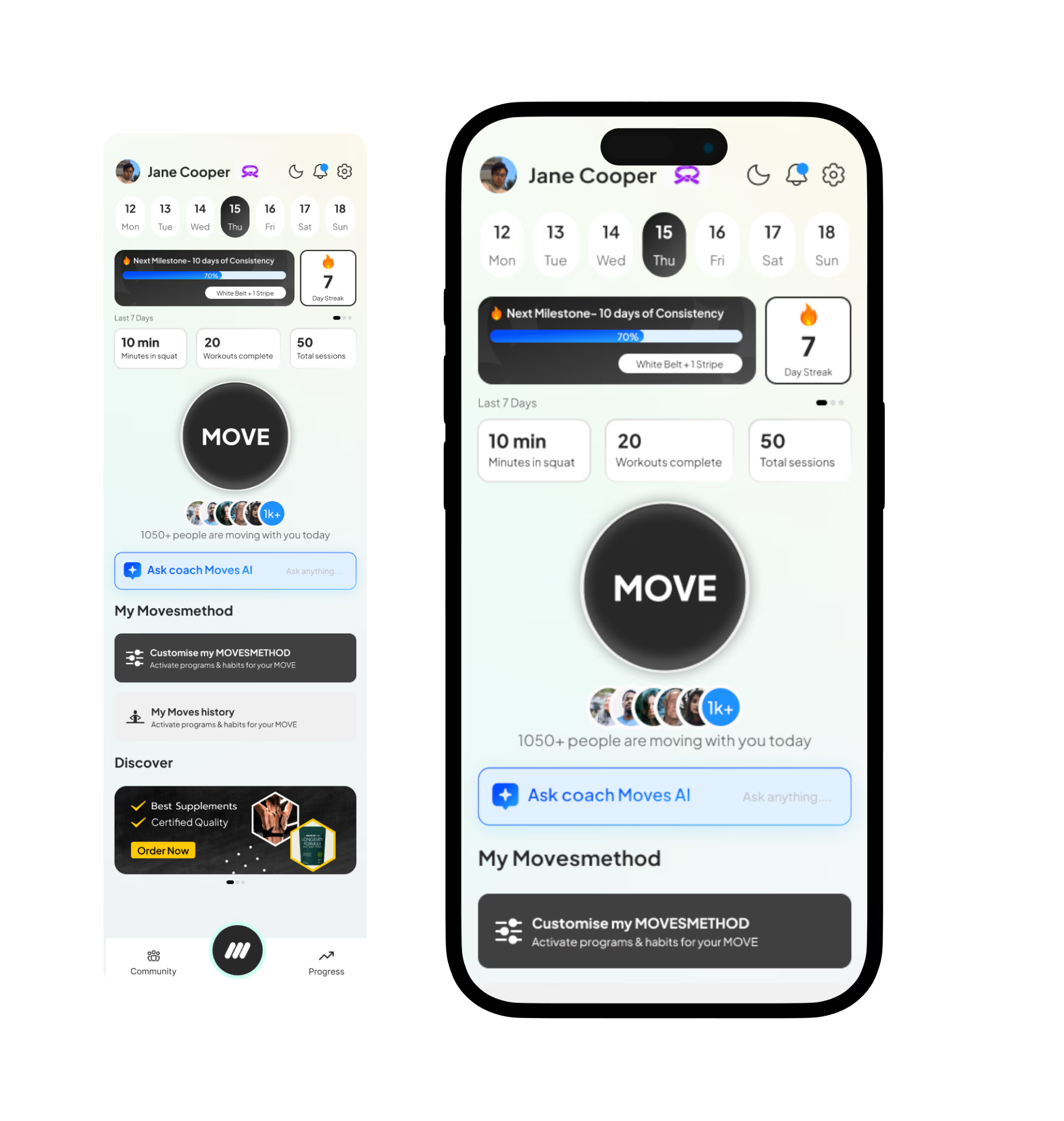
Section-based modular layout. Each feature in its own card. New features plug in without redesign.
Progression system
Martial arts belt metaphor, using one sport to explain another. Cluttered visuals, high cognitive load.
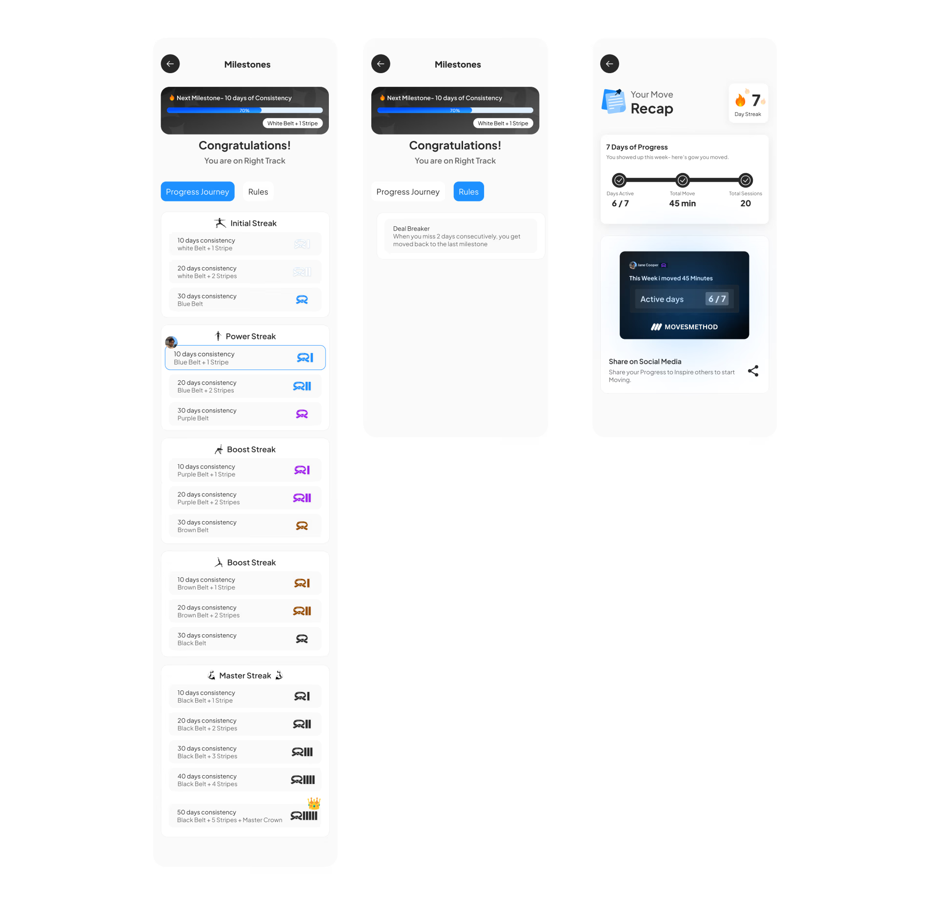
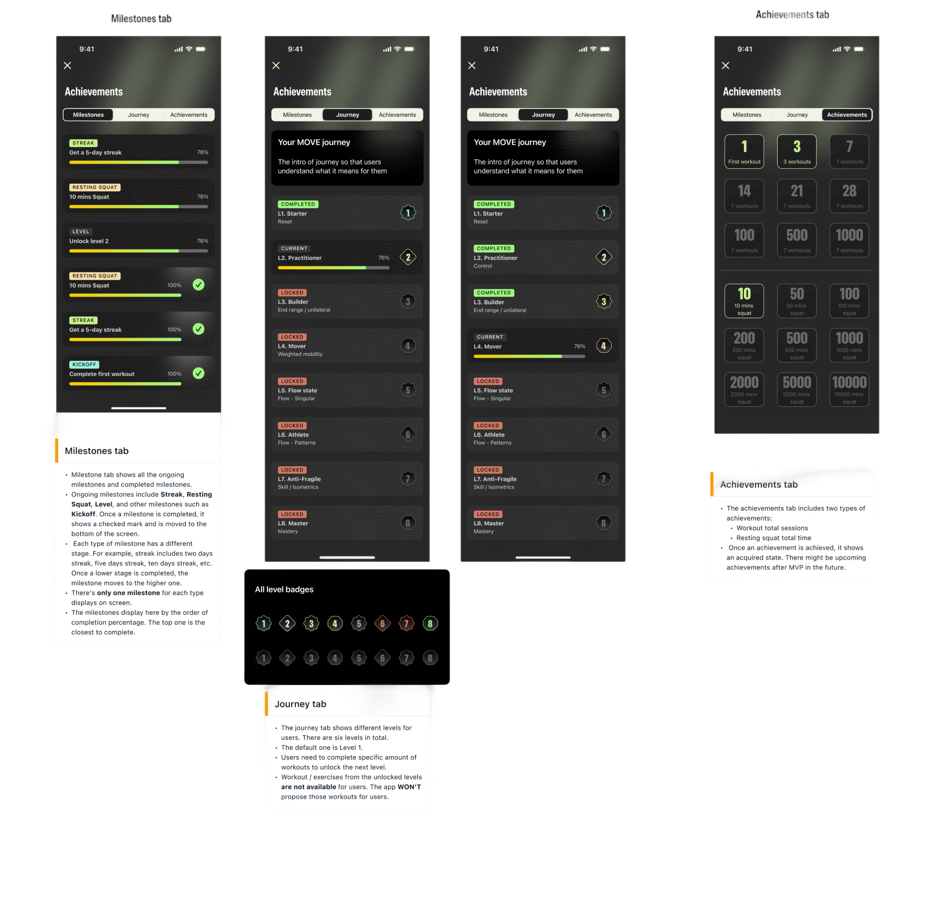
Clean level system benchmarked against Nike Running Club and Strava. Instantly intuitive, easy to maintain.
Visual direction
Light UI with inconsistent colour usage and no connection to MovesMethod’s existing product lines.
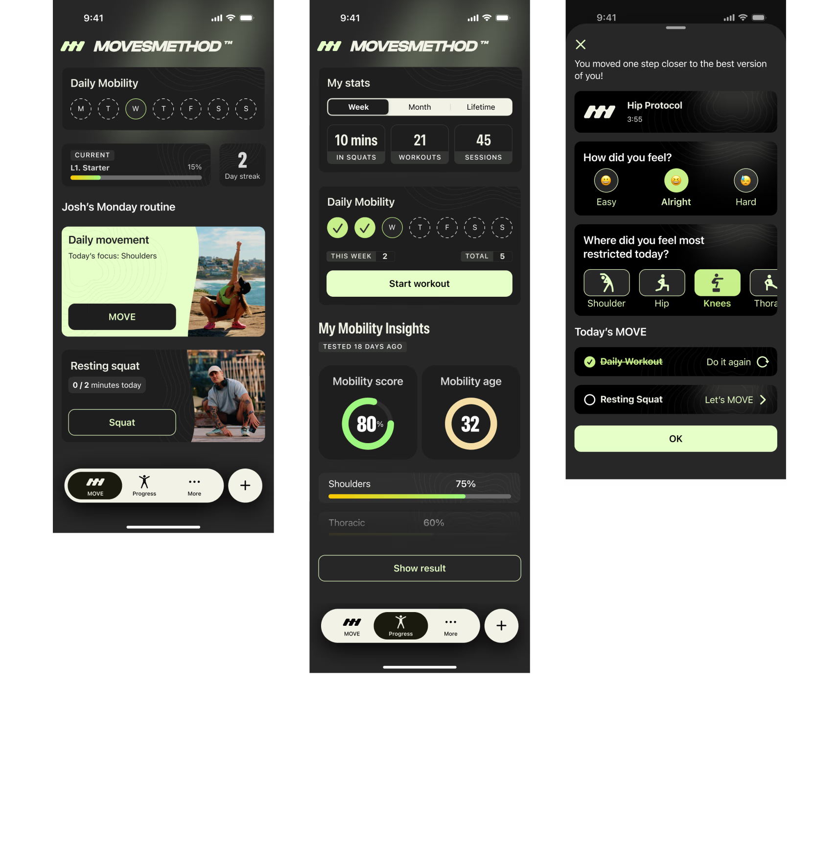
Dark UI aligned with brand identity. Single-mode strategy eliminated dual-theme dev overhead.
Design system
No system. Every screen built ad hoc, with inconsistent typography, spacing, and components.
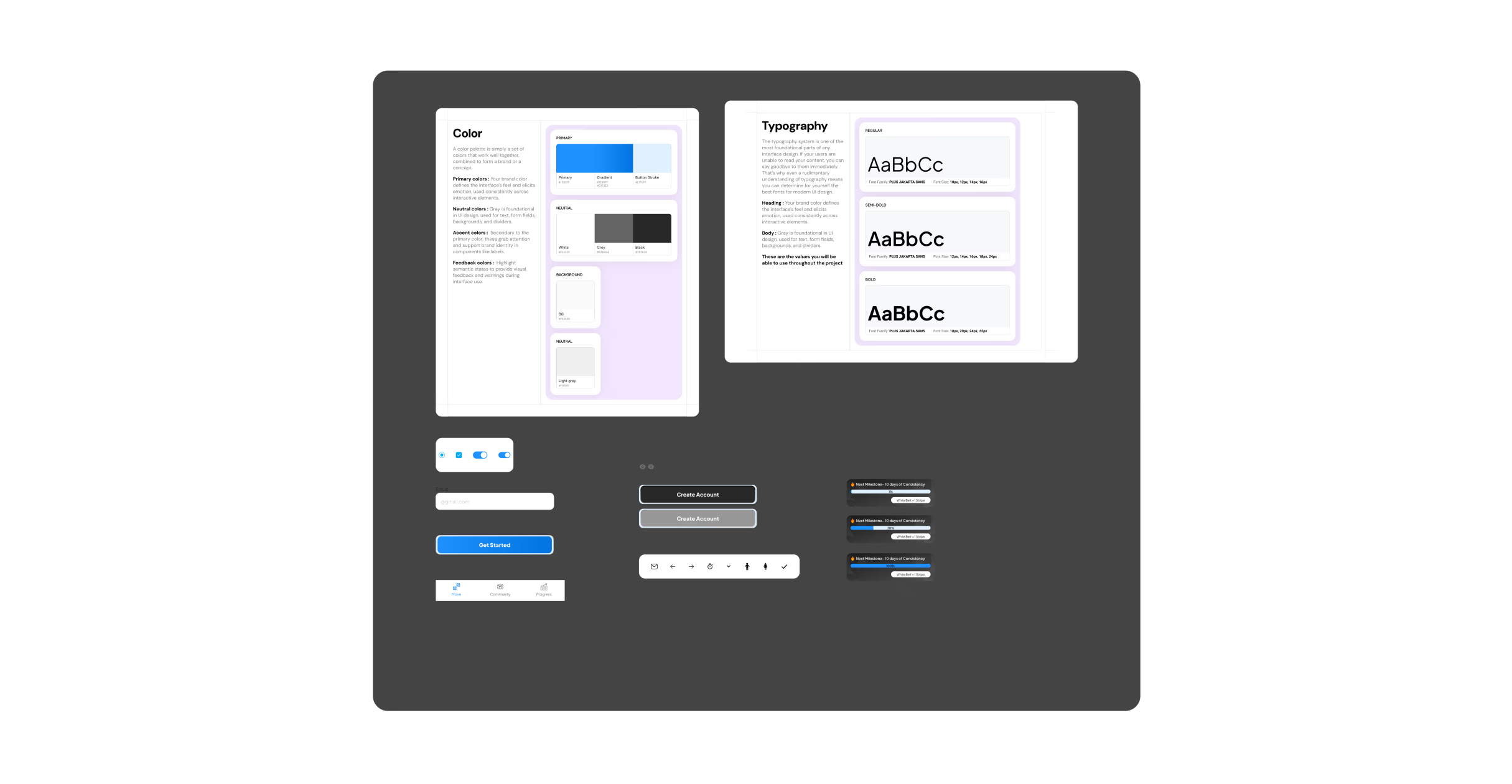
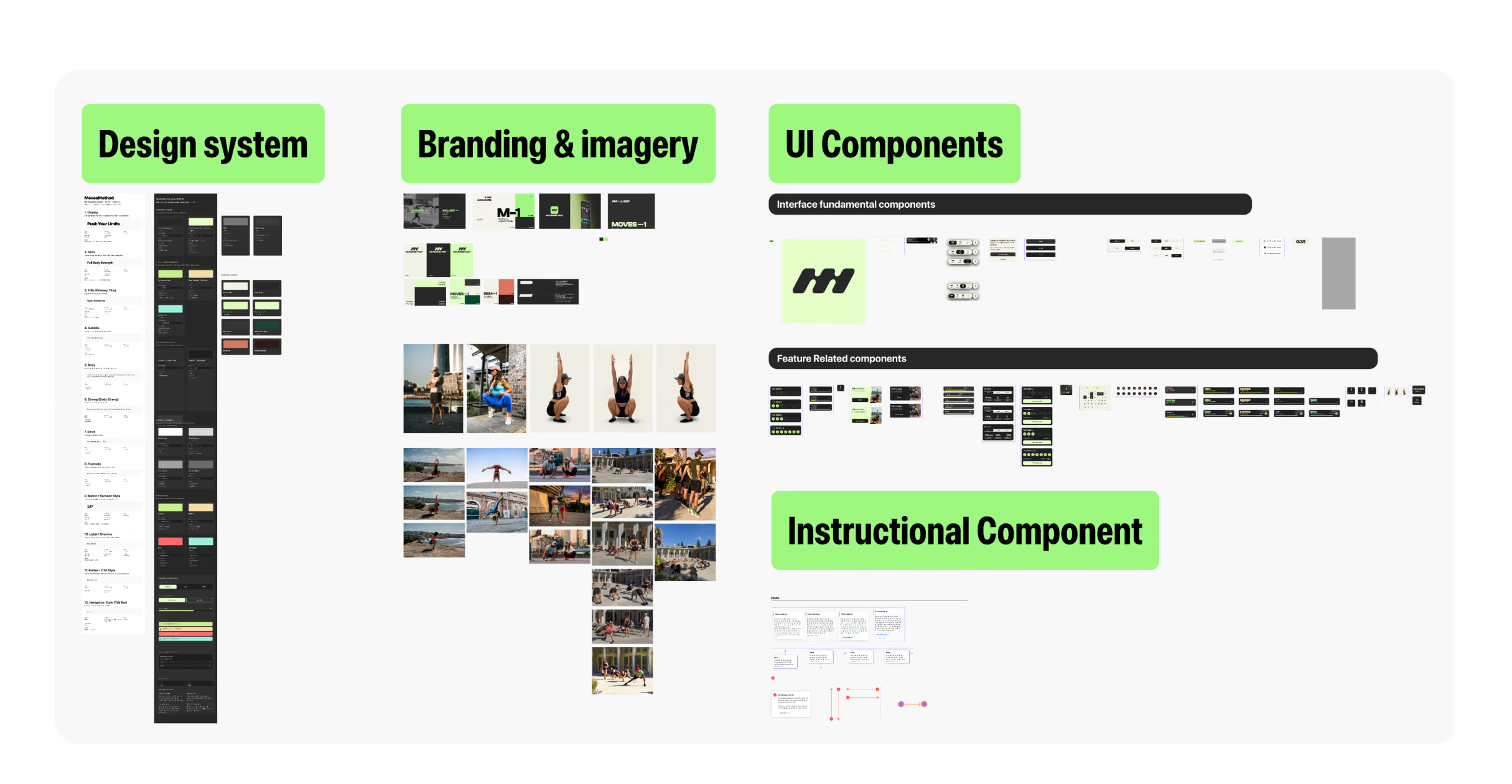
Complete design system: SF Pro, SF Symbols, colour tokens, component library, documented patterns and guidelines.
What changed? Not the engineer. Not the codebase. Not the founder's vision. The design leadership changed.
An audit before any design tool
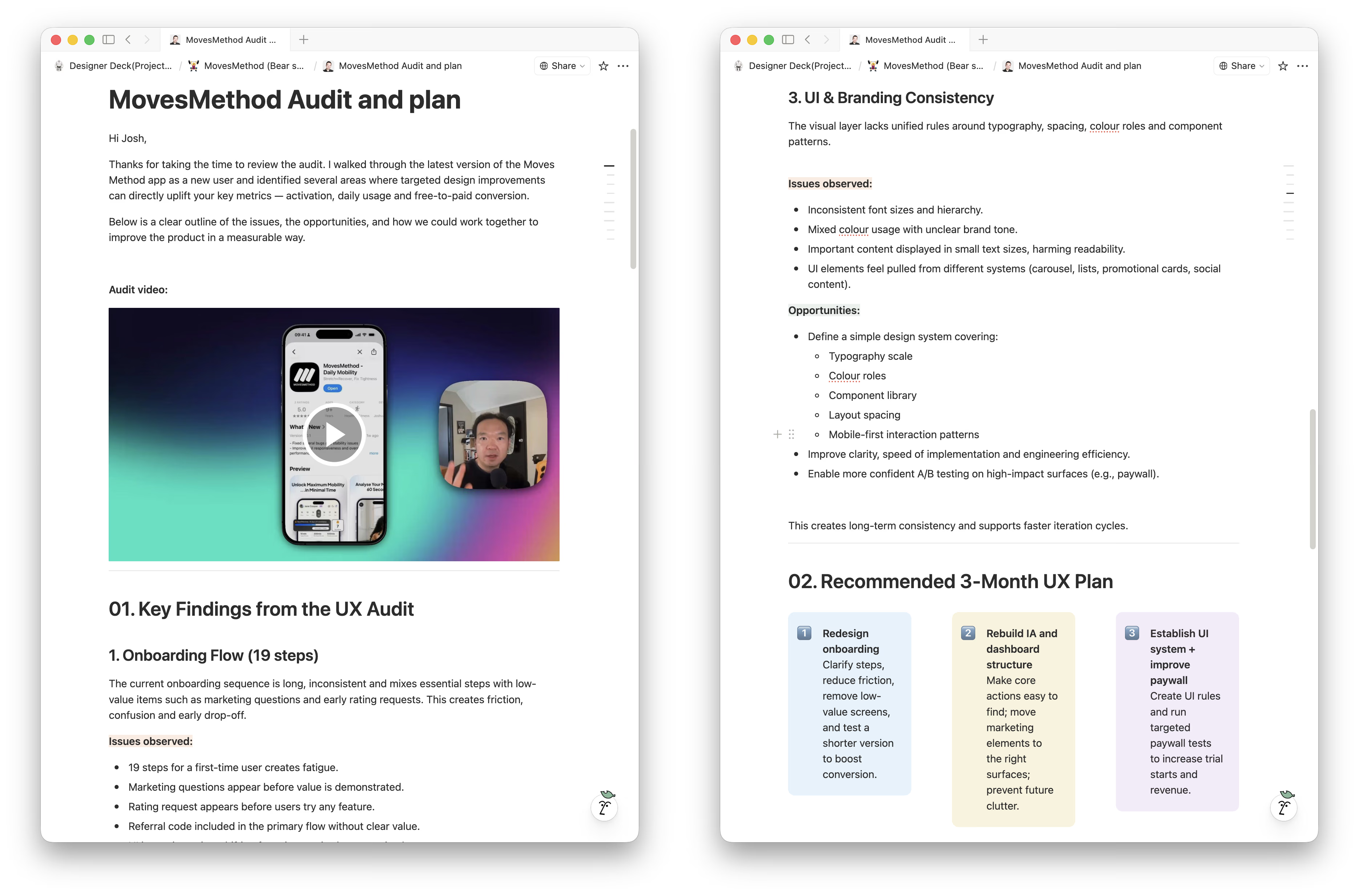
Before touching any design tool, I conducted a full UX audit, walking through the entire app as a first-time user and recording a detailed video review for the founder.
The previous design had been built without a mobile-first mindset. No design system, no scalable component logic, no coherent visual language. Edge cases like error states, empty states, and subscription lifecycle were entirely undesigned.
The core issue: this was a product that lacked system thinking. Launching it as-is would accelerate failure, not validate the idea.
I documented findings into a structured assessment and proposed a 3-month UX plan: redesign onboarding first (biggest conversion impact), then rebuild the IA, then establish the UI system.
Why this needed more than a designer
The team had already tried hiring a designer. They got deliverables, built what was designed, and ended up with something they couldn't use.
The founder screened eight designers. Full-time was too expensive and unnecessary for the stage. An agency felt too detached. What he needed was senior-level product judgment two to three days a week, not just pixel output.
In his words: “I've never done anything like this before, so I wanted someone with visual experience actually doing it so I can bypass mistakes, speed up the process, and do it with more quality. MovesMethod is quite a big brand. I didn't want to just put anything out there that I designed myself.”
That's what a Fractional Design Partner does. I don't take briefs. I write them.
Building the foundation
The dark UI decision
Shifting from light to dark was a product decision, not an aesthetic one: brand alignment (professional fitness software + unified product line), development efficiency (one colour mode, not two), and early lock-in (preventing weeks of downstream back-and-forth). The team agreed immediately. One conversation that unlocked the entire visual direction.
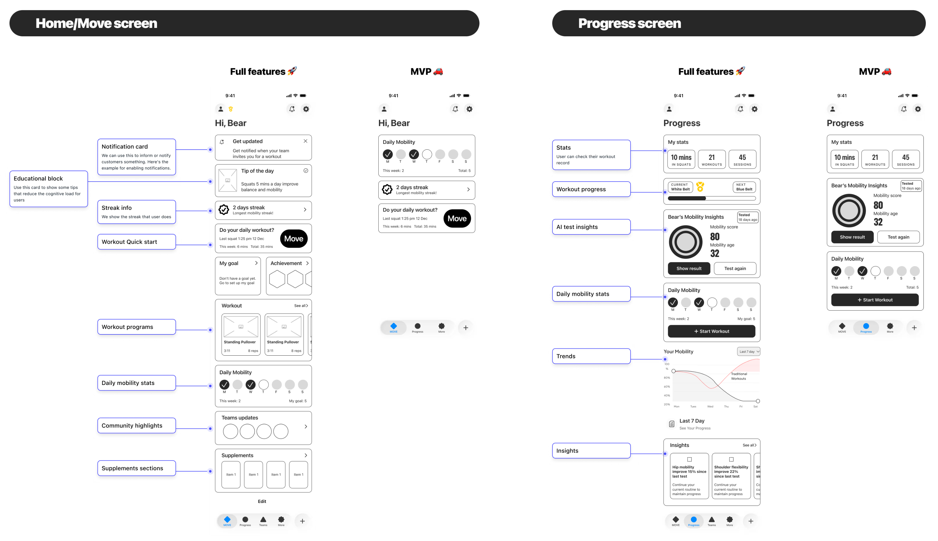
Section architecture
The most important structural decision. A section-based, card-driven layout where each feature occupies its own section. New features are added by inserting a section. No existing screens need redesigning.
To help the team understand, I created a wireframe of the ideal future state with all possible features mapped out, then filtered down to MVP scope.
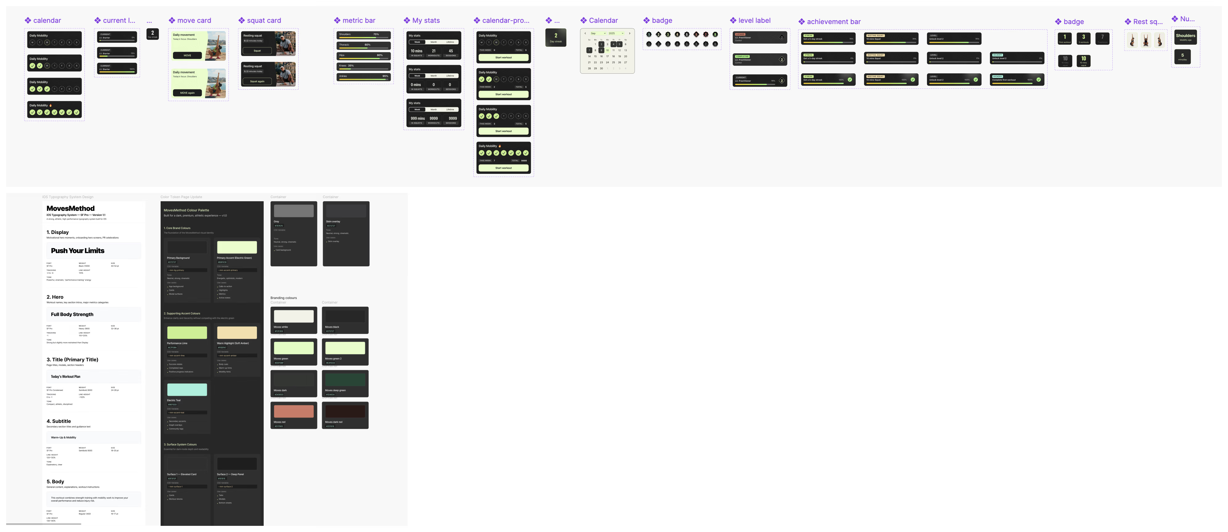
Typography, iconography and design system
SF Pro + SF Symbols as the native iOS foundation. Complete design system documented: colour tokens, spacing, components, patterns.
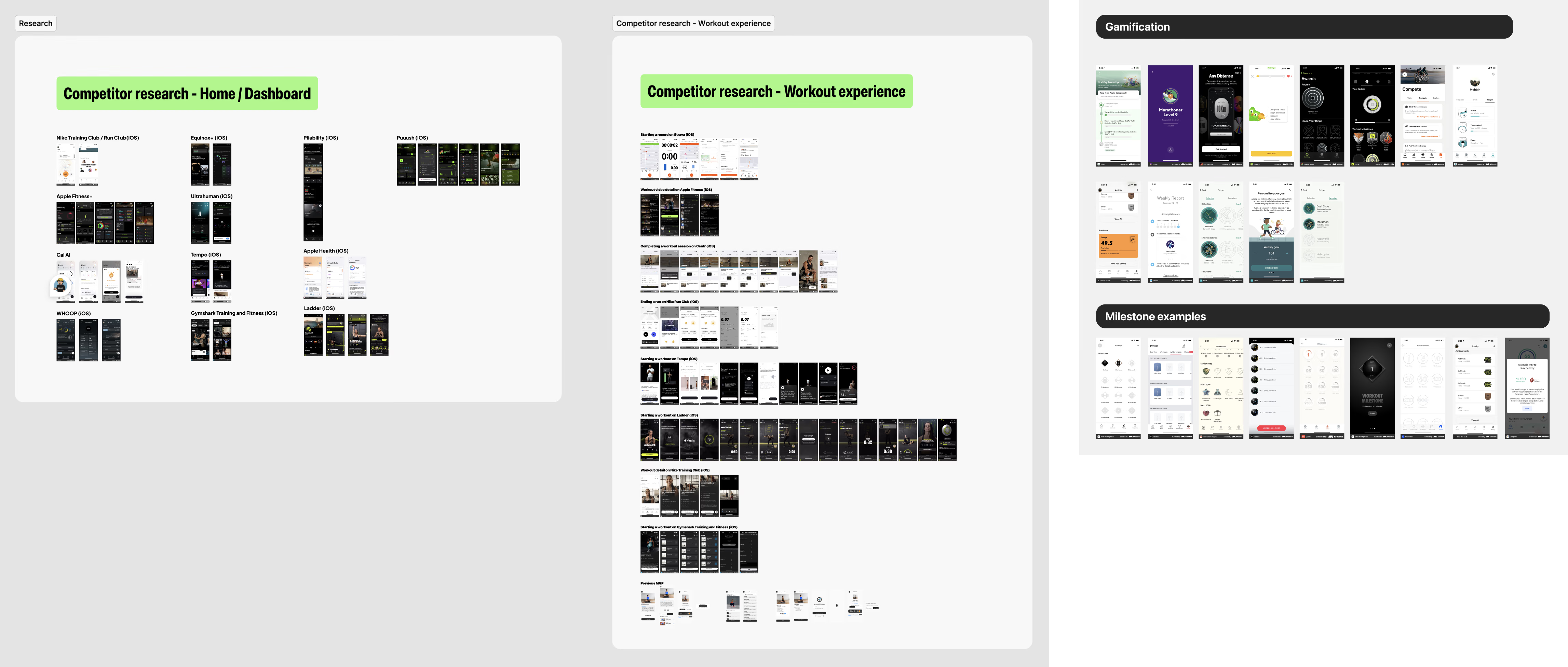
Simplifying the progression system
Replaced the belt metaphor with numeric levels after benchmarking against Nike Running Club and Strava. For users: instantly intuitive. For the team: dramatically simpler to build and maintain.
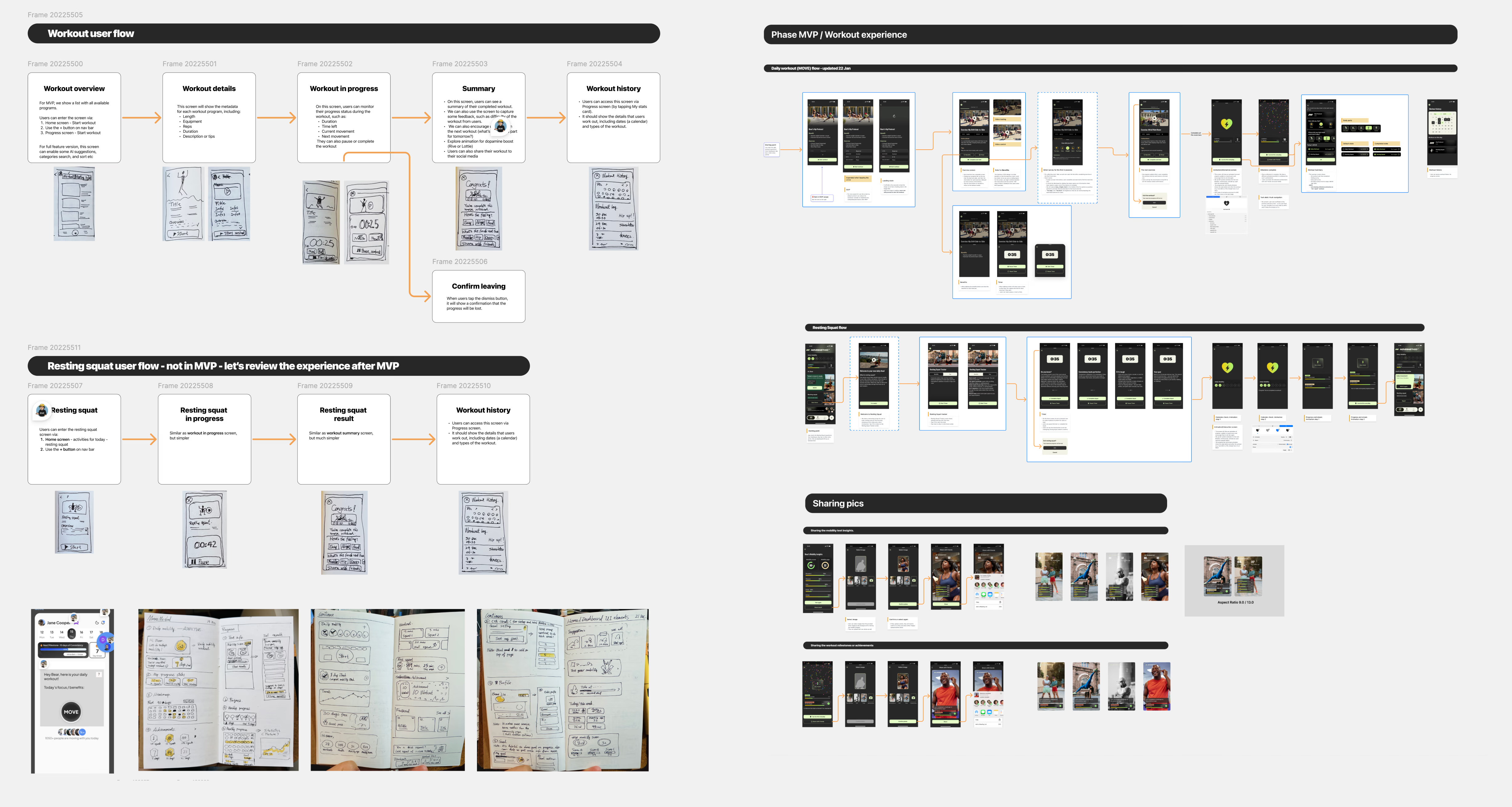
Designing the full experience
Core product loop: three pillars
Mobility Testing creates awareness: users see exactly where they need to improve. Workout Flow creates the habit through structured daily sessions. Gamification sustains motivation with a level-based incentive system reinforcing the daily loop.
Mobility Insight Report
High information density: users need to understand what their results mean, what ideal looks like, and what to do next. I explored three interaction approaches and built working prototypes of each using Claude Code:
- Vertical scrolling: natural but loses context in dense data
- Horizontal swipe pagination: each insight gets a full screen, no interference
- Expandable cards: compact but restricts display area
The team chose horizontal swipe after tapping through all three variants in a single session. A decision that would have taken days with static mockups.
The final Insight Report, horizontal swipe, is the image at the top of this page.
Complete coverage
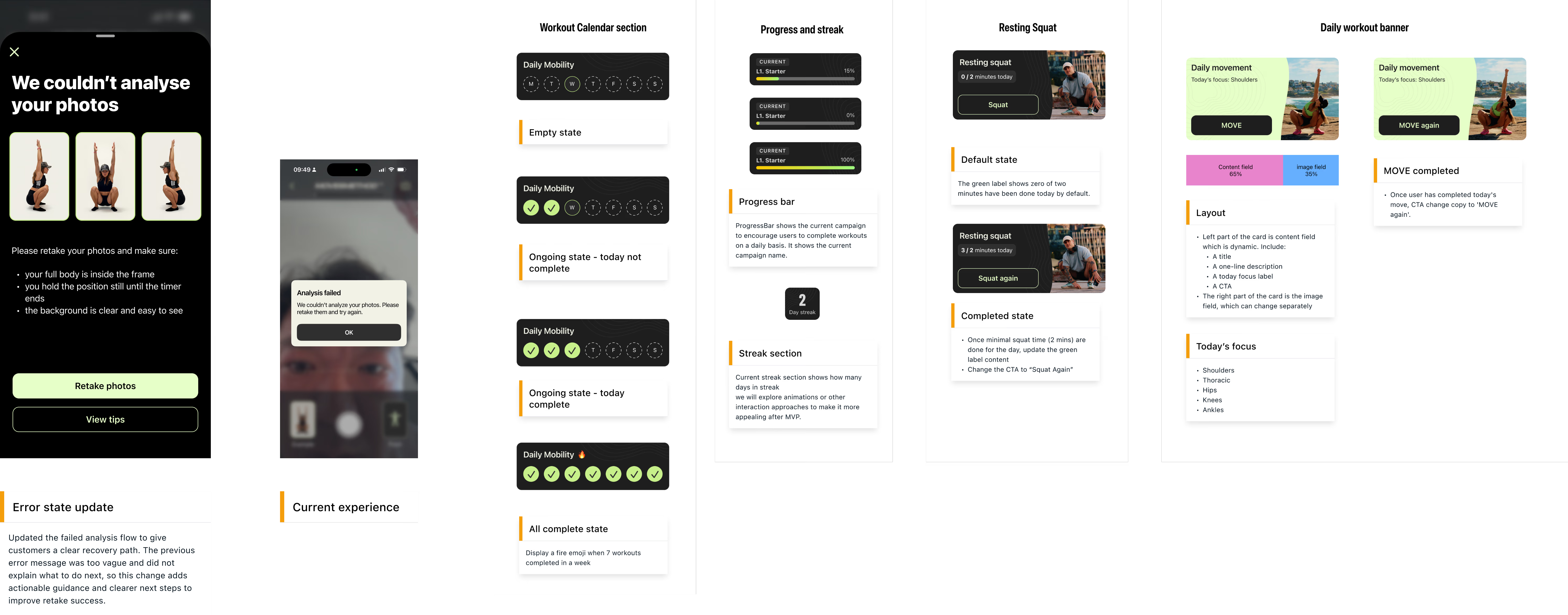
Every error state, empty state, loading state, share flow, and subscription lifecycle state. Designed and documented.
AI as a multiplier
AI was part of my workflow. It was never in charge of my decisions.
Where AI made me faster
Copy and microcopy iteration, rapid prototyping (three Insight Report variants built with Claude Code connected to Figma MCP), and accessibility auditing.
Where AI can't help yet
Diagnosing why a product isn't working, making structural architecture decisions, knowing which edge cases to design for, and earning stakeholder trust.
AI is a speed multiplier for execution. The thinking that determines what gets executed? That's still the job.
Leading the product process
For a small team with a first-time software founder, the process itself needed design.
Scope management
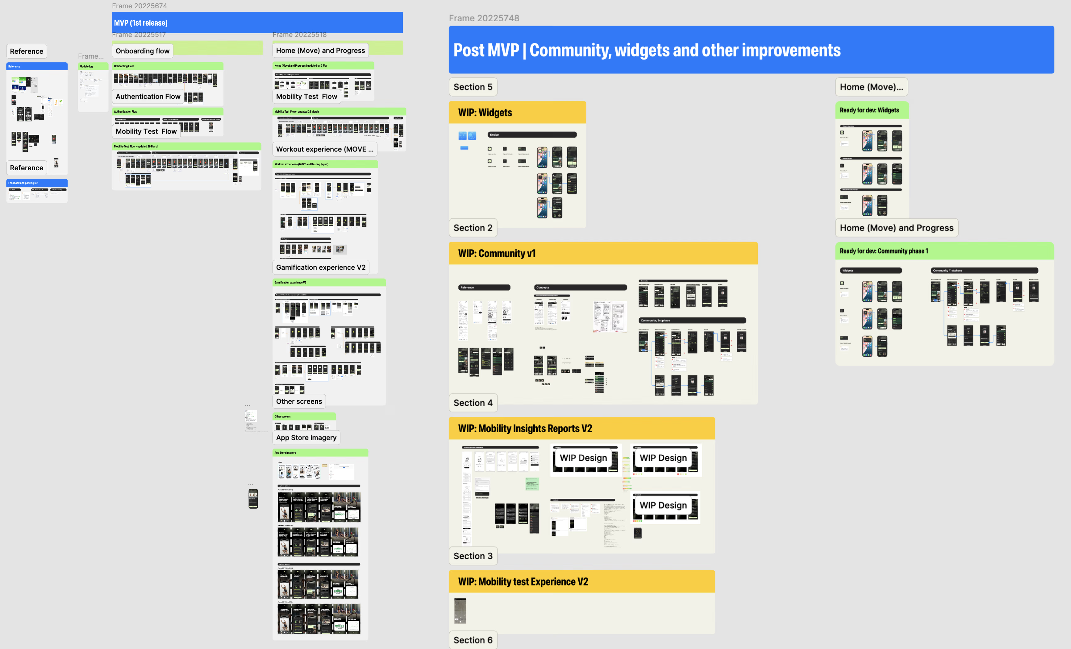
Separated MVP and post-MVP work directly in the Figma file. One delivery page for confirmed scope, another for designed-but-deferred features.
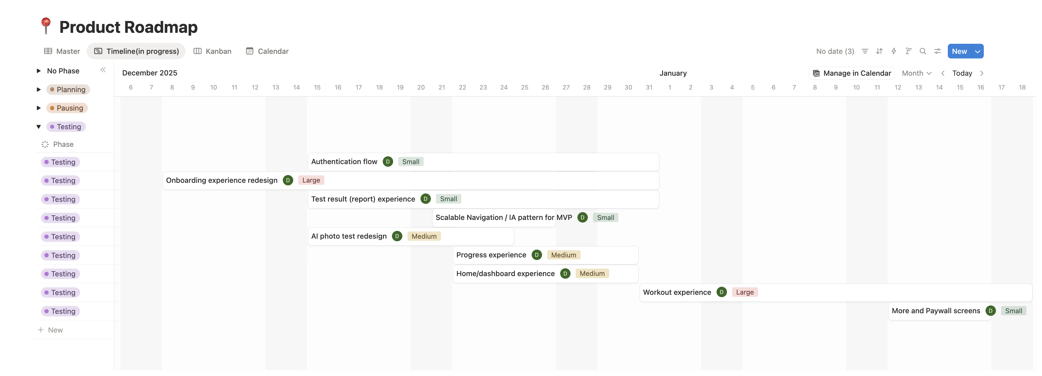
Notion roadmap
The team always knew what was in progress, what came next, and what was deliberately deferred.
Team retrospective
After the MVP push, I facilitated a retro. Standard for mature teams, new for this one.
Engineering-ready specs
Every design included interaction logic, conditional states, and coded component examples. Figma as the single source of truth.
That bridge role, connecting the founder's vision to the engineering team's implementation, is the invisible work that most design portfolios never show. But it's often the work that matters most.
What this project proves
MovesMethod was never an engineering problem. The code worked from day one.
It was a product design leadership problem, the kind that surfaces when a team has built something functional but hasn't shaped it into something users can understand, trust, and commit to.
The founder had the vision and the community. The engineering team had the technical ability. What was missing was someone to sit between product thinking and execution.
That's the work I did. And it's the work I do as a Fractional Design Partner.
The app has been approved on the App Store, ready to serve a community of 202K members. Its public release is waiting on the team's account migration.
In the founder’s words
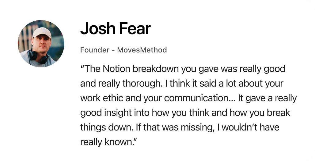
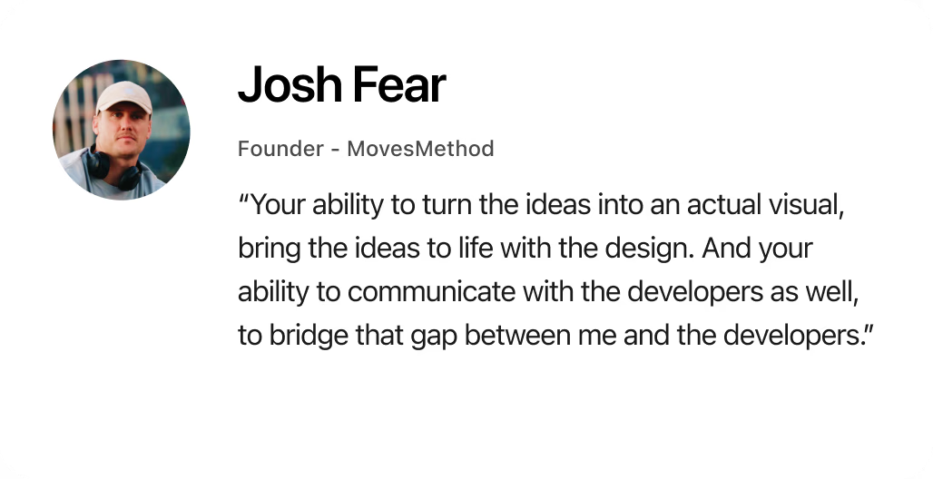
Asked to describe working together in three words, Josh chose refreshing, insightful and efficient: “Refreshing, because it's been so much easier to work with you than the previous designers we had. Insightful: I've learned a lot from seeing how you work and how you present ideas. And efficient.”
“I definitely think it’s worth it. I don’t really have a bad thing to say. If there’s anything that could be better, it would literally just be: I’d have you full time if I could.”