 Bear Liu
What makes 19 million people trust Wise?
Wise's website and app match almost perfectly, and that consistency turns out to be the cheapest thing about the product. The decisions worth reading sit in the few places where the two diverge, and in what a company built on transparency cannot explain when an account is frozen.
Wise’s website and mobile app are remarkably similar. For a product that handles money, it is easy to read that consistency as a sign of professionalism, reliability, and even trust.
But after comparing the two platforms side by side, I found that the more interesting parts were where they didn’t match. Why do certain features exist only on the web? Why does Wise suddenly become much less transparent when an account is frozen? And why can something as simple as freezing a card in a few seconds actually change user behaviour?
This teardown made me rethink a bigger question: where does trust in a product actually come from?
If you were about to hand a large amount of money to an app, what would make you trust it?
Would it be the way it looks? The fact that its website and mobile app feel almost identical? Familiar buttons in familiar places? Or would trust come from something more practical: before you hit Send, the app tells you exactly how much it will cost, how much the other person will receive, and when the money is expected to arrive.
I recently spent some time looking at Wise side by side on the web and on mobile. I also ran the same transfer through both platforms to see how they behaved.
The first thing you notice is how remarkably consistent they are.
The screens are the same. The wording is the same. The fee breakdown, arrival estimates, and even loading states appear in almost exactly the same places. Wise has made this part of its design philosophy too: wherever you use Wise, it should look, sound, and work in a familiar way, with as much clarity and as little confusion as possible.
For a product that handles money, that sounds like a sensible way to build trust.
But the longer I looked at Wise, the more interesting the question became:
Is consistency really the reason people trust it?
The answer is more complicated than it first appears.
Making two platforms look the same is less impressive than it seems
If you have worked on software, it is easy to look at Wise and see strong design discipline.
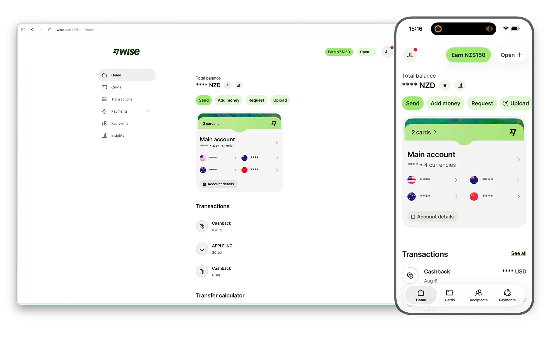
At many companies, the website, iOS app, and Android app are owned by different teams. Over time, the same feature slowly becomes three different features. A button moves on one platform but stays where it was on another. The website gets a new flow while the mobile app is still using the version from six months ago. Eventually, people need meetings, specs, testing, and cleanup work just to bring everything back into alignment.
Wise has taken a different approach.
Instead of asking each platform to reinvent the same product, it invested early in shared infrastructure. Many interface components come from the same design system, and some screens can even have their structure defined centrally from the server.
Think of a chain of coffee shops.
If every store designs its own menu, chooses its own cup sizes, trains staff differently, and invents its own ordering process, consistency becomes a constant management problem.
If the menu, cups, point of sale system, and operating process are designed centrally from the beginning, the stores will naturally feel similar.
Wise is much closer to the second model.
So when I see two nearly identical screens on Wise, I am less impressed than I used to be. Much of that consistency is simply what the underlying system produces.
The more interesting moments are when the two platforms do not match.
Because whenever they diverge, there is a chance that somebody made a decision.
The differences are where things get interesting
There are not many major differences between the Wise website and the app, but the ones that exist tell you quite a lot.
Some are easy to explain.
A phone has a camera, so it can scan QR codes. A desktop browser usually cannot. That is why certain QR based payment options, such as Alipay payments, make sense on mobile and are absent from the web.
Other differences are about where the work is likely to happen.
Businesses can upload a CSV file and make batch payments to hundreds or even thousands of recipients, but that feature only exists on the website. Exporting transaction history is also more naturally suited to a computer.
That seems reasonable.
Someone paying several hundred suppliers is probably sitting at a desk. Building the same workflow for a phone simply to maintain platform consistency may add very little value.
Then there are differences that are harder to explain.
Take Insights, Wise's spending analysis feature. It has a more prominent position on the website, while it sits deeper inside the mobile app. Yet the mobile app gives you finer control, including the ability to exclude an individual transaction from Insights.
The platform that promotes the feature more heavily actually gives you less control over it.
It reminds me of an old house that has been renovated many times. Every room works perfectly well on its own, but you can sense that different decisions were made in different decades, and nobody has gone back to rethink how the whole house fits together.
There is an even subtler example.
On the same phone, signing in to Wise through a browser and signing in through the Wise app can be treated by Wise's security system as two separate devices.
From the customer's perspective, it is one phone.
From the security system's perspective, it is two different entry points.
That distinction made something click for me.
Two interfaces can look almost identical while the systems underneath them make very different decisions about risk and trust.
Wise's smartest screen appears before you even sign up
The most commercially effective piece of design in Wise may appear before you have created an account.
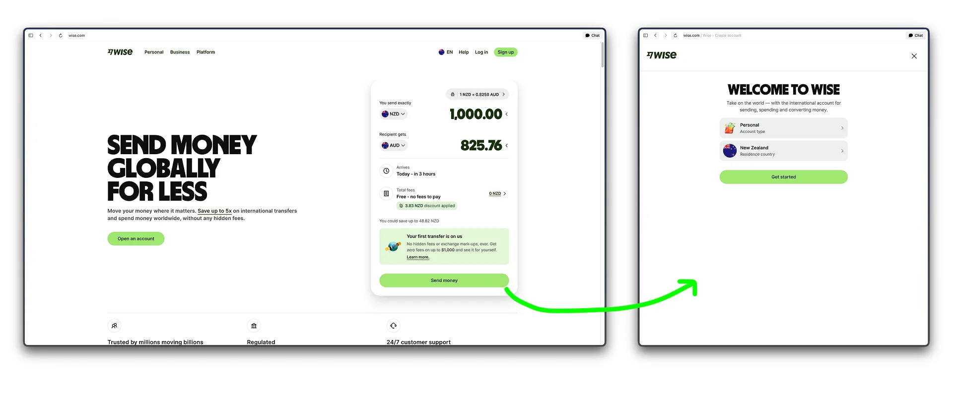
Open the Wise homepage and you are not greeted by a huge brand image or a list of impressive company statistics.
The main thing you see is a transfer calculator that actually works.
Enter NZ$1,000 and convert it to Australian dollars, and you immediately see the exchange rate, the fee, how much the recipient will get, and when the money is expected to arrive.
You can open the fee and see more detail. Wise shows where the money goes, including what Wise charges and what goes to the payment method.
There is even a competitor comparison.
In one NZ$1,000 transfer I tested, Wise showed the recipient receiving roughly A$830. Westpac came in at around A$813, and PayPal at about A$788.
At that point, Wise does not need a headline telling you that it is cheaper.
The numbers have already done the advertising.
The next step is even smarter.
When you decide to continue, Wise does not send you to another marketing page. It does not show you ten more features.
It asks you to sign up.
So the transfer calculator, which looks like a useful little tool, is effectively the first screen of the registration flow.
Before creating an account, the customer has already experienced the core value of the product.
That is a useful pattern far beyond fintech.
A lot of products begin by telling you how good they are, then leave it to you to verify the claim later.
Wise reverses the order.
It shows you the evidence first, then asks whether you want to continue.
Customers are buying something else too: certainty
While testing Wise, I noticed something else.
Wise explains price extremely well. It explains time much less.
I tried two US dollar transfers on the same afternoon.
One was estimated to arrive in about 30 minutes. Another would not arrive until the following day.
Same product, same afternoon, yet the difference in delivery time was huge.
Wise tells you when the money is expected to arrive, but it gives you very little explanation for why one route is so much faster than another.
That matters because people making a transfer are really buying two things.
One is price.
The other is certainty.
If you are sending $50 to a friend, a few extra hours may not matter much.
If you are paying rent, settling an invoice, paying a supplier, or trying to meet a deadline, knowing when the money will arrive may matter more than saving a few dollars.
Wise has done an excellent job of making pricing transparent.
The reasons behind transfer speed are still much more of a black box.
What happens when a brand built on transparency cannot explain?
This problem becomes much more obvious when an account is frozen.
Wise has an extremely high rating on Google Play, but many of the negative reviews cluster around a similar experience: an account is suddenly restricted or frozen, the customer does not understand why, support replies feel generic, and there is no obvious next step.
At first glance, that seems to clash with a brand built around clarity and transparency.
There is an important complication, though.
When financial institutions suspect fraud, money laundering, or other suspicious activity, they may be legally prevented from warning the customer in advance. In some situations, once certain reports have been filed, the institution may also be restricted from explaining exactly what triggered the investigation.
So at least some of Wise's silence is driven by regulation.
That creates a much more interesting product question:
If your product promises to explain clearly what is happening, what do you do when the law prevents you from explaining?
Wise still has a lot of room here.
There is relatively little public explanation of what an account review looks like, what customers can realistically do, how long different stages might take, or what happens next.
There is also little distinction between two very different situations:
"We are legally unable to tell you."
and
"We have not dealt with your case yet."
From the customer's point of view, both look exactly the same.
Silence.
And when people are given an information vacuum, they tend to fill it themselves. The explanation they invent is rarely the optimistic one.
This is a very common product problem.
You may not always be able to give someone an answer, but you can often explain the process.
Think about a delayed flight. Passengers obviously want the plane to leave on time. But when that is no longer possible, knowing why it is delayed, how long the delay might last, and what happens next is far better than staring at a red DELAYED label that never changes.
Transparency does not require you to reveal everything. The hard part is helping people understand what happens next when you cannot tell them everything.
The "extra step" on the website disappears on mobile
Wise's card management is another interesting example.
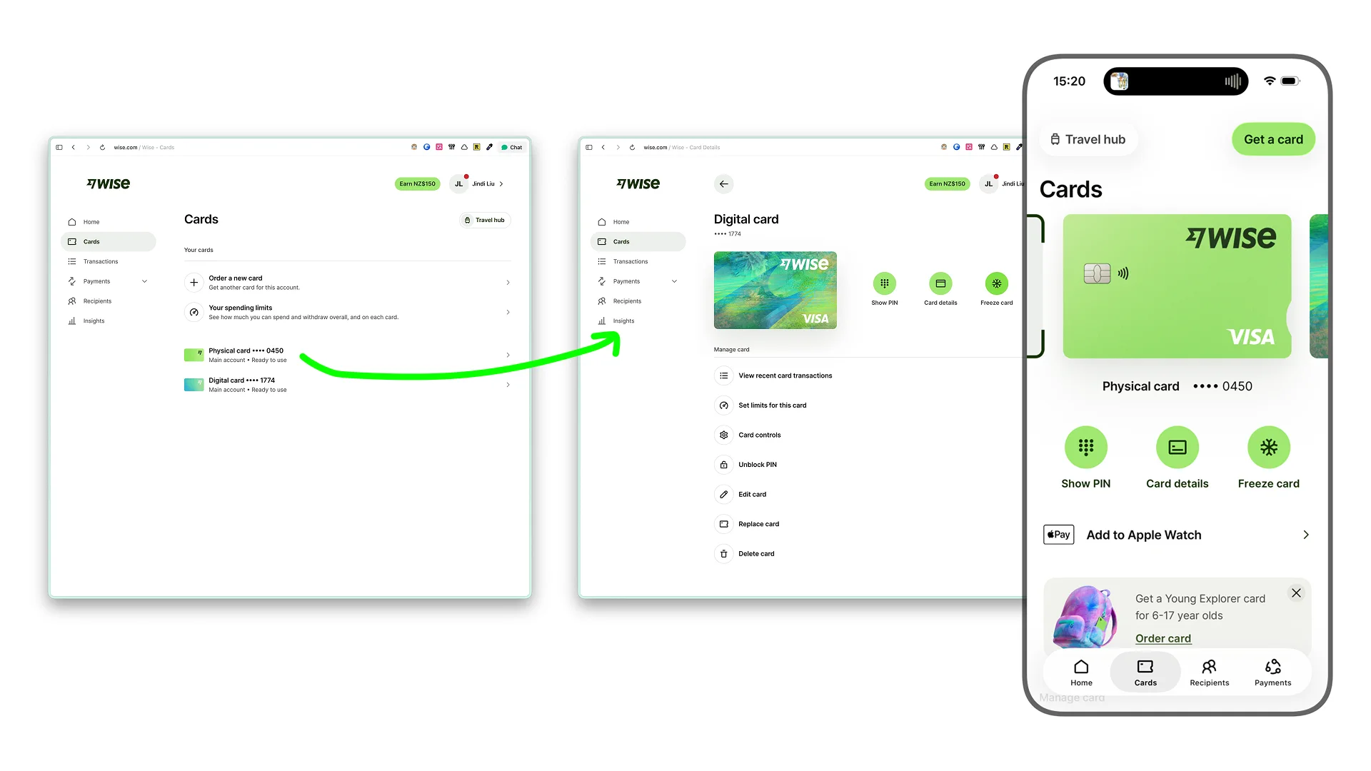
On the website, you first see a list of your cards. Each card shows its last four digits and current status. You select a card, open its details, and then perform actions such as viewing the PIN or freezing it.
It feels slightly old fashioned, but it is very clear.
The mobile app is more compact.
At the top of the card screen is a carousel that lets you swipe between cards. Underneath are actions such as Show PIN, Card details, and Freeze card. When you swipe to another card, those actions now apply to the newly selected card.
The problem is that the interface does not make that relationship especially obvious.
With one card, this barely matters.
With several cards, you need to pay more attention.
And "Freeze card" happens to sound like a fairly serious action.
So I tried it myself.
The card immediately turned grey and the button changed to Unfreeze. Tap it again, and the card is active.
The whole thing takes a few seconds.
That changed how I thought about the feature.
Most of us bring assumptions from traditional banking when we see something like "freeze card". Will I need to contact support? Will I need to verify my identity again? Will it take hours to restore?
Wise has made the action extremely lightweight.
That creates an unexpected advantage.
When reversing an action costs almost nothing, people become much more willing to use the safety feature in the first place. Some users even keep their card frozen most of the time, unfreeze it when they are about to pay, then freeze it again afterwards.
But that creates the next problem.
If someone performs this action two hundred times a year, making freezing easy is no longer the most interesting opportunity.
Automation is.
You could imagine rules that freeze a card above a certain amount, freeze it outside a particular region, or let customers define their own conditions.
There is a broader product principle here:
When a product makes a previously heavy action lightweight enough, user behaviour changes. Once behaviour changes, new product opportunities appear.
In 2023, Wise suddenly became very green
Another part of Wise that interested me is its 2023 rebrand.
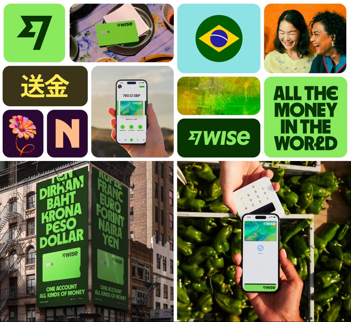
The company moved away from the familiar fintech blue and adopted a very bright green, along with a new typeface and a much more expressive visual language.
The product did not suddenly work differently.
The price did not change.
It simply looked different.
Yet in a Hacker News discussion about the redesign, a surprising number of designers started using a word that does not normally come up in conversations about colour palettes:
Trust.
Some felt that a company handling people's money should not look so playful. Others said the new identity made Wise feel less reliable.
If you only read those reactions, the conclusion seems obvious.
Financial products should look serious.
But the business data after the rebrand makes that conclusion much harder to defend.
Wise now has around 19 million active customers. The share of personal customers using multiple Wise products rose from roughly 44 percent around the time of the rebrand to close to 50 percent. Card spending and other parts of the business continued to grow.
The app rating remains around 4.8.
And when customers complain, the complaints are still mostly about frozen accounts, support, or when money will arrive.
Almost nobody is leaving a one star review because the app is green.
That made me think designers may sometimes overestimate how much visual style influences ordinary customers.
We spend our days looking at typography, spacing, branding, and interface patterns, so we naturally use those signals to judge a company.
Most customers are more practical.
They want to know:
How much will this cost?
When will the money arrive?
Has anything gone wrong for me before?
If the answers to those questions are good, whether a financial app is green or blue may matter much less than designers imagine.
Branding still matters, of course.
A more useful way to think about it is this:
Different audiences use different signals to decide whether a company feels trustworthy.
Designers may pay close attention to typography and visual language.
Most consumers are more likely to judge price, speed, and their own history with the product.
If your customers happen to be designers, developers, or people who spend all day inside software, the visual layer may carry much more weight.
The same design decision can therefore produce very different reactions depending on who the product is for.
So what is actually worth learning from Wise?
If you only take screenshots of Wise, it is tempting to focus on how consistent the website and mobile app are.
The longer I looked at it, the more I felt that this is also the easiest lesson to copy badly.
Wise can maintain that level of consistency because it invested in shared systems and dedicated infrastructure teams years ago.
For a smaller company, spending every product cycle trying to keep web and mobile pixel perfect could be extremely expensive, while producing relatively little additional value for customers.
The more useful lessons are elsewhere.
First, Wise knows what its core commercial promise is, and it puts the evidence in front of you before asking you to sign up.
Second, it understands that platforms should be consistent where consistency helps, while still allowing certain tasks to live on the device that suits them best.
Third, it has taken actions that traditionally feel heavy in banking, such as freezing a card, and reduced them to something you can reverse in seconds.
And finally, there is the part I find most interesting:
Trust matters most when things stop going smoothly.
When fees are low, transfers arrive on time, and the interface looks polished, customers have very little reason to think about trust.
The real test comes in different moments.
Why has my money not arrived?
Why was my account frozen?
Why am I unable to do this?
Which card will this button affect?
What happens next?
These screens rarely make it into a product launch. They are not the glamorous parts of a design system or brand presentation.
But for a financial product, they may be the most important interfaces of all.
If I had to reduce everything I saw in Wise to one idea, it would be this:
Consistency makes a product easier to use. Trust is built in the moments when things diverge, when risk appears, and when the product cannot give you a complete answer.
Those are also the moments most worth designing.
If any of those questions landed without a clean answer, that gap is worth a closer look.
I write diagnoses like this one for other products: where your design is quietly serving the wrong outcome, what that is costing you, and what to change first. If you would like one for yours, email me at hi@bearliu.com.