Why Does Google Health Keep Asking You Questions?
Apple Health stays quiet while Google Health keeps asking. Those questions are how the product collects what a passive tracker cannot record, and its citations mark exactly where Google's confidence ends.
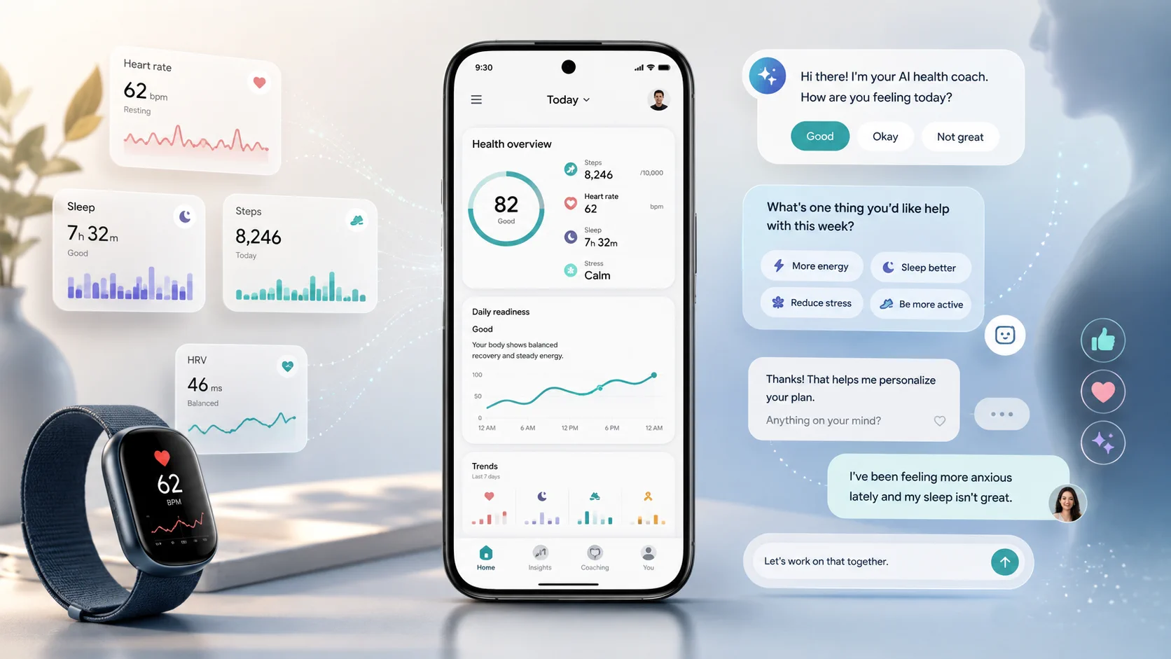
Google Health may look like Fitbit with an AI coach added on top, but after using it for three weeks, I began to see a more important role. A wristband can record your heart rate, sleep and exercise. A conversation can reveal what you worry about, what you want to change and which advice works for you. This article looks at how Google collects that intent through design, and what the approach means for other AI products.
A health tracker can tell how many hours you slept last night, how many steps you took today and whether your resting heart rate has changed. What it cannot tell is why you suddenly started paying attention to your sleep, why your heart rate worries you or what you are actually trying to change.
Google Health’s AI coach fills that gap. It asks questions, offers answers you can select with a tap and notices which suggestions you accept, ignore or dismiss.
The wristband records your body. The conversation records your intent.
After using it for three weeks, I began to think this may be the most valuable part of Google Health.
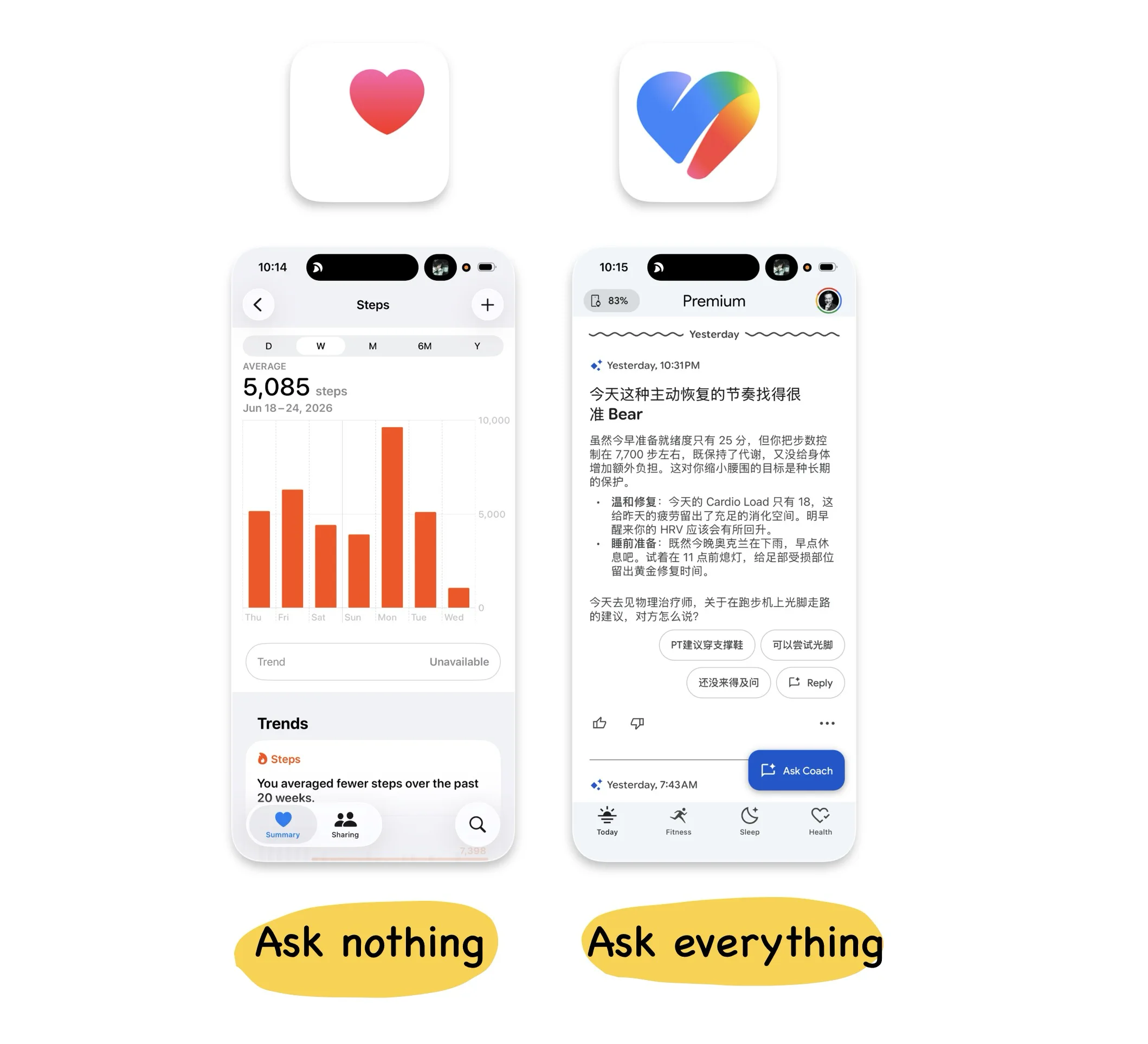
Apple stays quiet. Google keeps asking.
In my previous article, I looked at Apple Health. It is an unusually quiet product. Most of its data is written automatically in the background by the Apple Watch and other devices, so users rarely need to open it. It behaves more like a health database that quietly accumulates information over many years.
Google Health takes the opposite approach. Soon after you open the app, its AI coach may comment on last night’s sleep, a recent workout or a change in your heart rate, then ask how you feel about it.
I once asked what my resting heart rate meant for me. The coach pulled in thirteen days of data, showed a range between 59 and 68 beats per minute, generated a chart I could inspect day by day and supported its explanation with external health sources. It then followed up with another question:
“Does that overview give you the peace of mind you’re looking for?”
When I told it I was taking heart-related medication, it carried that information into the next reply. When I switched to Chinese halfway through the conversation, it continued naturally. As an interaction, the coach is genuinely well executed.
The more interesting question is why it is so eager to keep the conversation going.
Apple Health relies mainly on devices collecting information passively. Google Health turns almost every surface into another opportunity to interact. One rarely asks anything from you, while the other continually invites you to respond. Those choices reflect the different businesses underneath the products.
Apple’s health strategy depends on the iPhone and Apple Watch. It needs people to trust that years of sensitive health records can safely remain inside the Apple ecosystem. Protecting that trust helps Apple continue selling devices.
Google’s strengths have long been built around data and machine learning. Health information is subject to tighter restrictions, and Google says it does not use this data for advertising, but the company still needs behavioural feedback to improve its products and models.
A useful health coach can therefore do two jobs at once. It helps users understand their bodies while giving Google information that sensors cannot capture.
Your step count tells Google what you did. Your questions, answers and reactions tell it what you care about.
Every tap becomes feedback
Google Health does not make data collection feel especially aggressive. Its visual language is restrained. Thumbs-up and thumbs-down controls appear as thin outlines, menus sit quietly in light grey and suggested responses are placed inside soft, rounded buttons. You can engage with them or simply move on.
Yet when I began counting the feedback points on a single screen, the density was surprisingly high. One card might contain:
- Thumbs-up and thumbs-down controls
- A menu for “helpful”, “not helpful” or “dismiss”
- Several prepared responses
- A free-text input
- A follow-up question from the AI
These controls look lightweight, but they produce different kinds of data. A thumb rating evaluates the model’s response. Suggested replies classify the user’s intent. Even dismissing a card tells the system that the content may not be useful.
Rejection is feedback too.
This is one of the more accomplished parts of Google Health. It maintains a high density of data collection while keeping the visual weight of each control low. The user does not feel as though every screen is a questionnaire, yet the model can still collect a steady stream of training signals.
The question is whether most users understand that dismissing, skipping or lingering on something may also help the system decide what they prefer.
Google Health does not hide these controls or force people to answer. It simply makes the collection process feel so natural that users may barely notice how much feedback they are providing. Good design can make an interaction easier while also making the collection behind it harder to see.
Google wants a platform, but much of the data still belongs to someone else
Google describes Google Health in ambitious terms. The product is meant to understand the user, connecting sensor data with personalised health guidance.
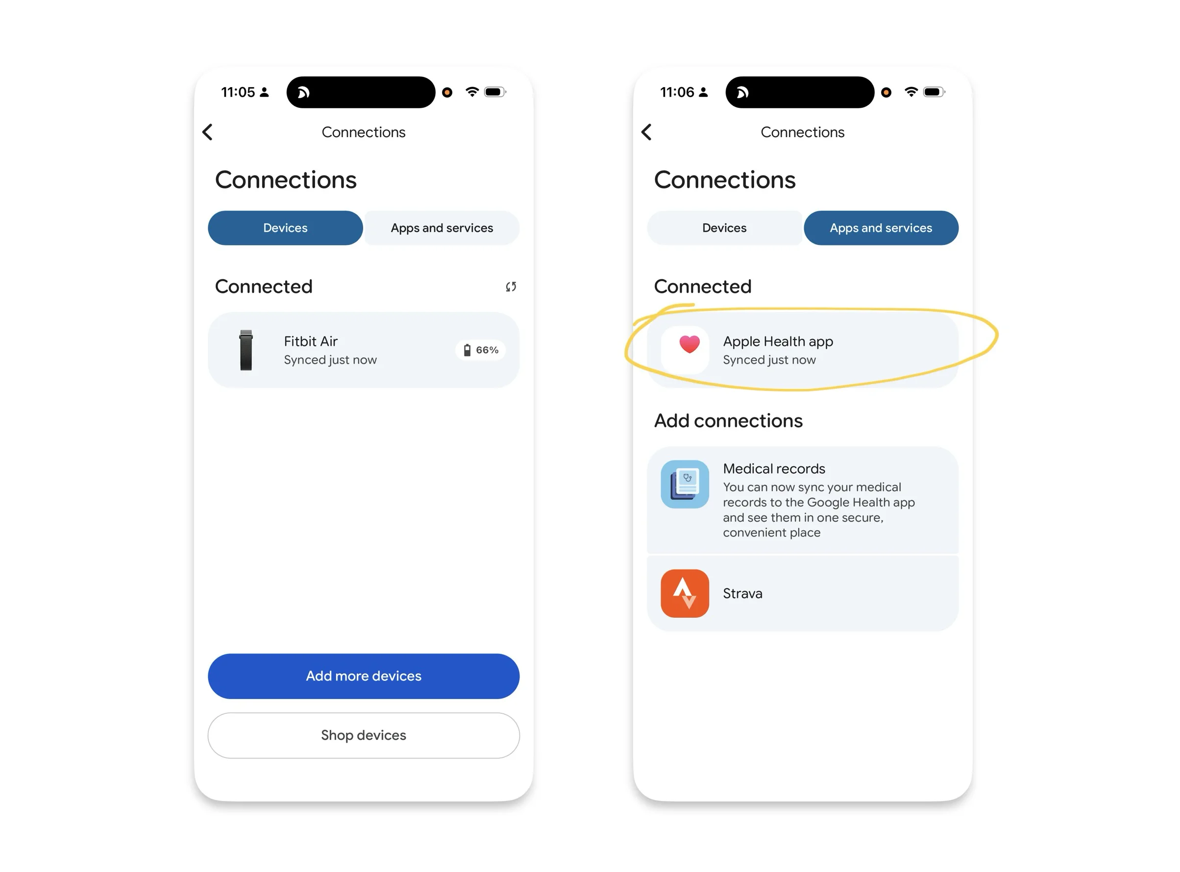
Open the connections page, however, and you find three very different types of data source. The first is information collected directly by Fitbit devices, such as heart rate, sleep and exercise. The second comes from other platforms, including Apple Health. The third consists of health records imported through external medical systems.
They appear as a tidy list in the interface, but Google has very different levels of control over each source.
Consider my weight. It is first measured by a Withings scale, then written into Apple Health and finally read by Google Health. Google can display the number, but it did not measure it. If Apple changes its permissions, APIs or platform policies, that data chain could be disrupted.
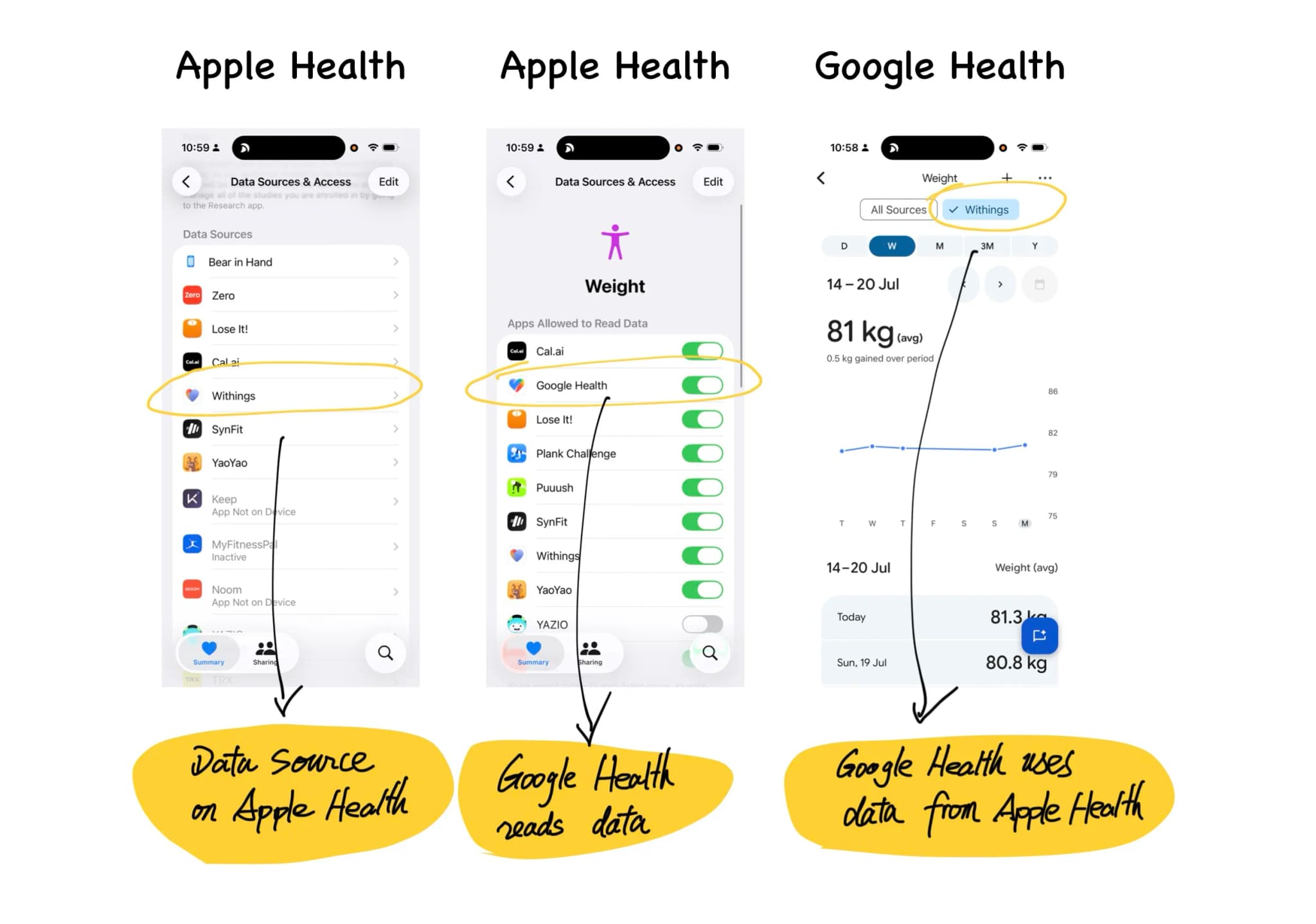
This also helps explain why Google was willing to pay $2.1 billion for Fitbit. Fitbit’s value went beyond its app and existing user base. It gave Google a piece of hardware capable of collecting data directly from the user’s body.
Google can read information from Apple Health, but it cannot build a long-term foundation on a competitor’s platform. With Fitbit, at least one important stream of data is controlled by Google from the sensor all the way to the model.
This is easy to overlook when analysing a data product. We often look at what data a product contains without asking where that data came from. Which sources does the company collect itself? Which depend on partners? Which remain under the control of a competitor? If one of those companies closed its interface tomorrow, how much of the product would still work?
A platform can look complete while much of it remains built on borrowed ground.
The most important parts of an AI product happen around the chat box
The chat interface in Google Health is not particularly new. A user asks a question, the AI answers and the conversation continues. That pattern now appears in almost every category of software.
The more interesting part is how Google Health starts the conversation and what happens after it ends. I find it useful to divide an AI conversation into three stages.
Before the conversation
Before the user types anything, the system needs to identify something worth discussing and turn it into a question that is easy to answer.
Google Health does this well. It might look at your sleep and exercise data and generate an observation such as:
“Going to bed around midnight seems to be working well for you. Does keeping that schedule feel manageable as you head into the weekend?”
Below the question are several answers you can select immediately. The user does not need to face an empty input field or work out what to ask. The system has already prepared the topic and the opening line.
This solves one of the most common problems in AI products. An empty chat box may contain unlimited possibilities, but it also leaves people with no idea where to begin. A feature can be extremely capable and still be forgotten because users have no clear reason to start a conversation.
Google Health speaks first, and the user only has to tap. From the user’s perspective, the coach feels proactive and attentive. From Google’s perspective, the cost of providing another piece of information has been reduced to a single interaction.
During the conversation
Google Health can interpret personal data, generate charts, cite external sources and keep the exchange moving with follow-up questions.
It does this competently, but these capabilities will become increasingly common. Any company with sufficient access to models, data and engineering resources will eventually be able to produce a reasonable chat experience. The chat box will soon become basic infrastructure.
After the conversation
This stage determines whether users return over the long term.
Will the AI summarise recent changes a week later? Can it notice that your sleep is gradually deteriorating and raise the issue before you ask? Will it remember the goal from your last conversation and check on your progress a few days later?
During my three weeks with Google Health, very little of this happened. I did not receive an automatically generated weekly report, and the coach rarely followed up on earlier conversations. Most interactions still required me to open the app or select a card.
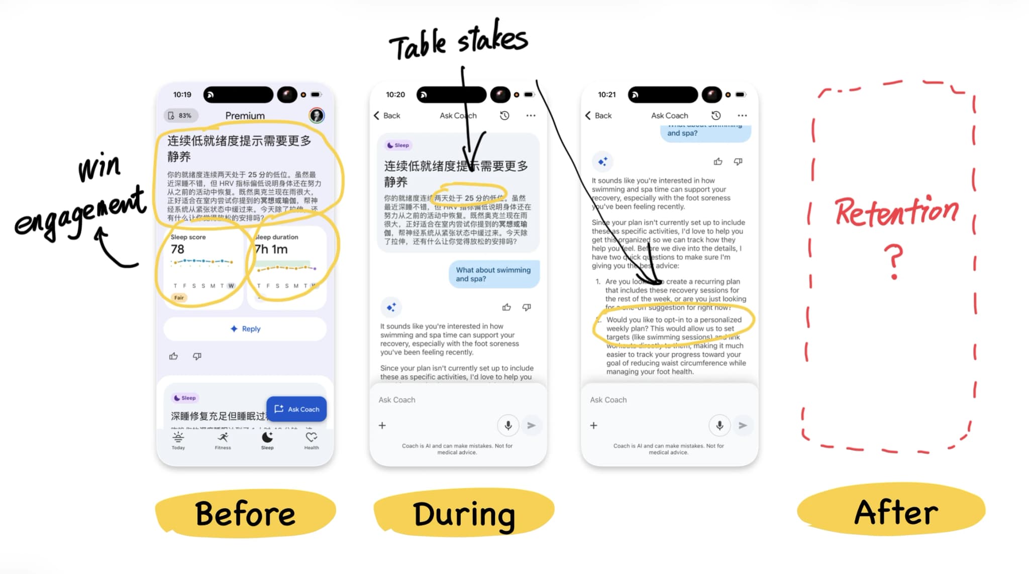
That may be partly because the product has only recently launched. Proactive health guidance carries much more risk than an ordinary chat interaction. One inaccurate or unnecessarily alarming notification could seriously damage trust.
Still, the lesson extends beyond Google Health. What happens before the conversation determines whether people begin. The conversation itself will gradually become a standard feature. What happens afterwards is what can create a lasting relationship.
Many AI products invest almost everything in the chat box and then wait for users to return on their own. They attract attention at launch, then lose usage a few weeks later.
A useful coach can also be an efficient data entry point
It would be too simple to describe Google Health only as a machine for collecting information. In my experience, the coach is genuinely useful.
It can turn scattered data about heart rate, sleep and exercise into explanations that are easier to understand, then adapt the conversation to the user’s personal situation. A service that provides real value will naturally encourage people to keep talking, which also means that the more helpful the product becomes, the more information users may provide.
Google Health can be a valuable health service and an efficient data collection system at the same time. The value of the service is precisely what encourages people to continue answering.
The important question is whether that exchange is sufficiently clear.
Google says it does not use health data for advertising. In the European Economic Area, the Fitbit acquisition is also subject to data-separation commitments lasting at least ten years. Those are meaningful limits, but “not used for advertising” answers only a narrow question.
Will the data be used to improve health models? Could it support other Google AI products? Might the policies change in the future? Most users cannot find complete answers to those questions in a single privacy statement.
The interface also communicates through its behaviour. When every screen contains questions, ratings and feedback controls, users will naturally feel that the system is observing and recording them. The promises written in a privacy policy need to match the experience presented by the product. Otherwise, one reassuring paragraph will struggle to outweigh dozens of feedback buttons.
Citations reveal where Google’s confidence ends
Google Health contains another revealing detail.
When information has been prepared in advance by Google’s editorial or health teams, the app usually presents it in Google’s own voice, accompanied only by a disclaimer that it should not be used for diagnosis or treatment. When an answer is generated dynamically by AI, the system is much more likely to cite external sources such as Healthline or Healthdirect.
Human-edited content is more stable, so Google is willing to stand behind it directly. A model-generated answer carries more uncertainty, so the product borrows support from external authorities.
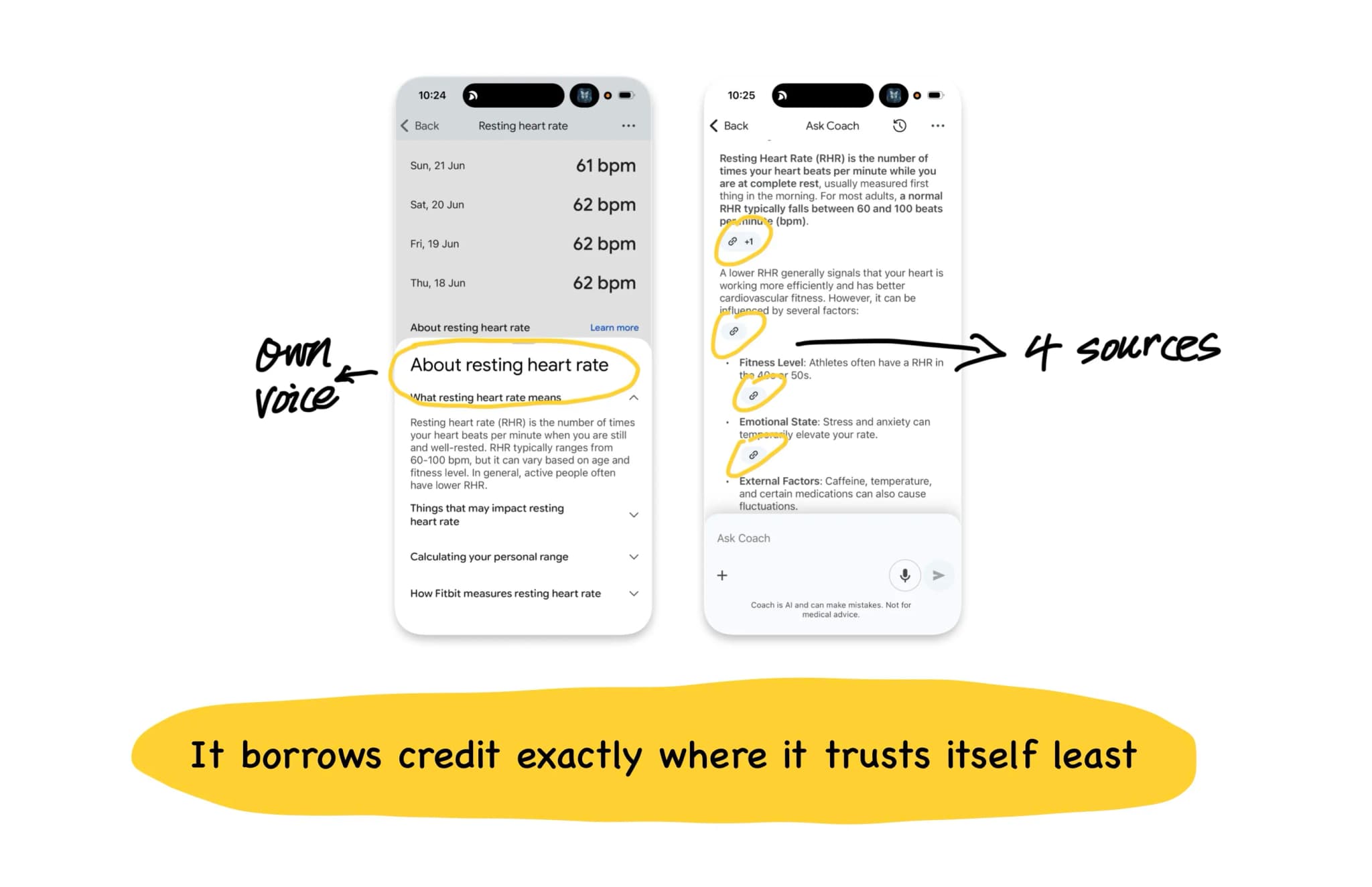
The citations function as a kind of hallucination insurance. They cannot guarantee that the model is always correct, but they allow users to see where the information came from and verify it when necessary.
The same principle applies to other AI products. The more a claim depends on real-time model generation, the clearer its sources and uncertainty should become.
Do not copy only the surface of Google Health
After looking at Google Health, a product team might reach an apparently sensible conclusion: add an AI coach, create more feedback controls and personalise the experience using user data.
Whether that strategy works depends on the business underneath it.
Google can support dense data collection because it has the models, infrastructure and broader product ecosystem required to turn that information into useful capabilities. The health app is only one part of a much larger value chain.
A standalone health startup copying the same design may get a very different result. It can add ratings, prompts and tracking controls to every card without having the systems required to make meaningful use of that information. The user absorbs the psychological cost of being observed, while the company gains little in return.
Apple Health cannot be copied in isolation either. Apple can afford to keep the product quiet because the iPhone and Apple Watch already generate revenue. The restraint of the Health app increases the long-term value of the hardware. Google can afford to keep asking questions because every conversation may improve its models.
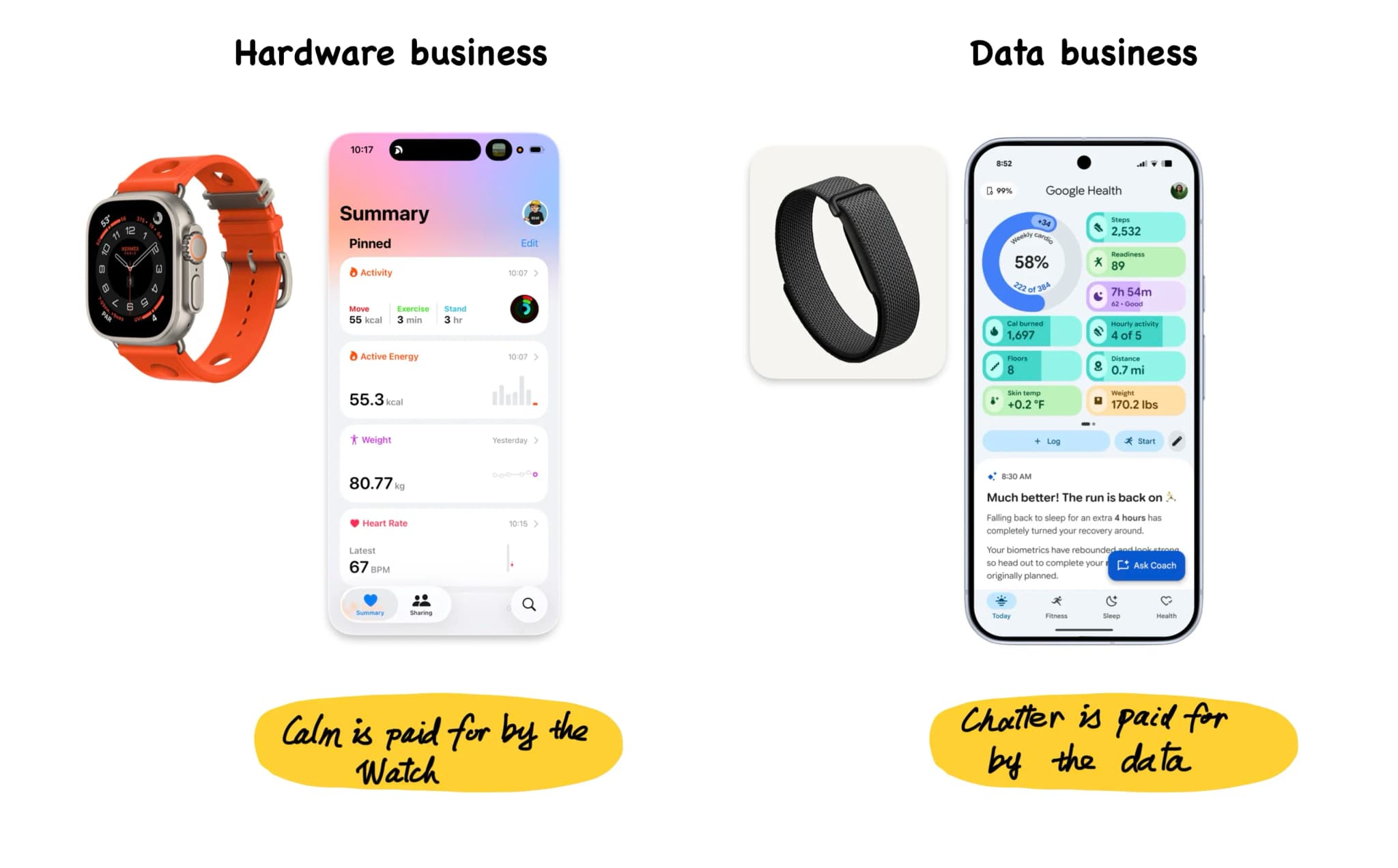
Both directions can work, but they depend on very different foundations. Before copying another company’s interface, identify the business engine supporting it. Without that engine, a successful-looking design may become an additional cost.
The questions Google Health leaves behind
The most useful lessons from Google Health are less about a particular card or chat interface and more about the questions the product raises.
What does your AI feature do before the user types anything? Does it provide a specific enough opening for people to understand why the conversation is worth starting?
What happens after the conversation ends? Does the product remember goals, follow changes and return with useful information at the right time?
How much of your data do you collect directly, and how much depends on partners or competitors?
Do users understand how their taps, dismissals and silences are being used? When a model produces advice in health, finance or another high-risk category, are the sources clear enough?
Most importantly, does the interface make the same promise as the privacy policy?
What stayed with me most about Google Health is that the same design decision can improve the experience while collecting more data. Proactive questions make the coach feel intelligent and attentive, while also helping Google understand the user. Suggested replies reduce effort while making intent easier to classify. Feedback controls let users correct the system while turning every acceptance and rejection into another training signal.
The real question is how the company intends to use that information, and whether users understand the exchange.
A wristband records your body. An AI coach begins to record your goals, concerns and choices. Once a health product reaches that point, trust can no longer be established through a privacy policy alone. It also lives in every question, every button and every decision about when the system chooses to speak again.
If any of those questions landed without a clean answer, that gap is worth a closer look.
I write diagnoses like this one for other products: where your design is quietly serving the wrong outcome, what that is costing you, and what to change first. If you would like one for yours, email me at hi@bearliu.com.