 Bear Liu
Building CUBE with AI: What I learned about design, taste and finding users
An experiment in building a product with AI, making design decisions, and discovering what happens when real people start using it.
A few days before launching CUBE, I was showing it to some founders at Hack Aotearoa, a local meetup in Auckland.
One of them liked the tool but immediately pointed out a problem. The blue in CUBE wasn't the blue of their brand. They wanted to use the images for marketing, but couldn't use something that didn't match their brand colours.
Two founders asked me about using CUBE for marketing that week. One even offered to pay.
That caught my attention. Because creating branded marketing assets wasn't really what I had in mind when I built it.
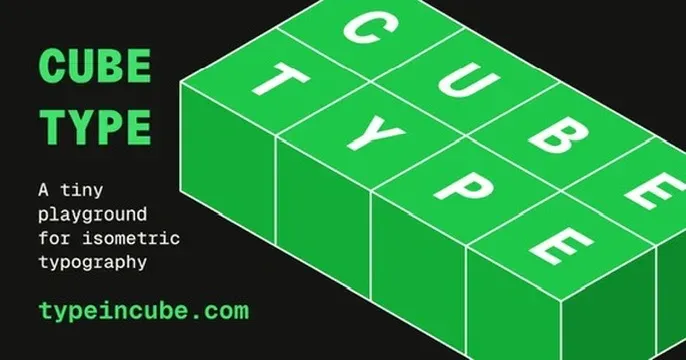
CUBE is a small web app that turns ordinary text into 3D isometric typography. You type something, choose a style and colour, and export the result as an image or animation.
I started it as a side project, partly to explore an idea I'd had for a while, and partly to experiment with designing and building alongside AI.
As a product designer, I've spent years working with developers to turn ideas into real products. With tools like Claude Code, I can now do much of that work myself.
But building CUBE brought up two questions I hadn't fully considered.
First, when AI can handle much of the implementation, where should I spend my time as a designer?
And second, once I've built something, how do I find out whether anyone actually wants it?
The second question turned out to be particularly interesting.
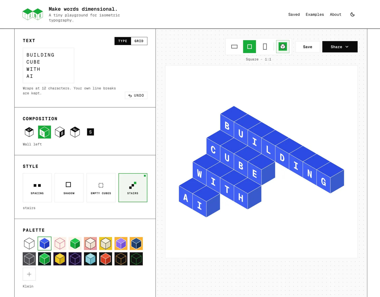
Part 1: Designing and building alongside AI
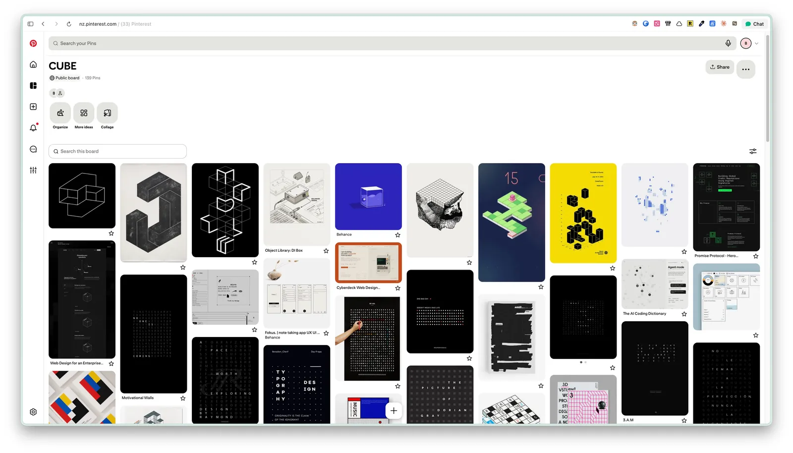
It started with a Pinterest board
Like many of my design projects, CUBE started with collecting references.
I made a Pinterest board full of isometric typography, geometric shapes, and interface designs I liked.
For the interface, I kept coming back to Braun's industrial design. Simple controls, clean typography, and Dieter Rams' famous principle: less, but better.
I also explored some beautiful vintage styles. I liked them enough to consider using them for the interface.
But when I put everything together, something didn't feel quite right.
CUBE's output was already modern and geometric. Combining it with a vintage-looking interface felt like mixing two different products.
So I dropped that direction.
This is one thing I've always enjoyed about design. You can explore dozens of directions, but eventually you need to decide which ones belong together.
AI makes exploration much faster. I can ask for five variations of an interface and get them almost immediately. I can also turn a rough idea into something interactive and see whether it works.
But the number of possibilities can become a distraction.
With traditional development, every additional feature or interaction comes with a cost. That naturally encourages some restraint.
When implementation becomes easier, it's tempting to keep adding things simply because you can.
I found myself having to be more deliberate about what to leave out.
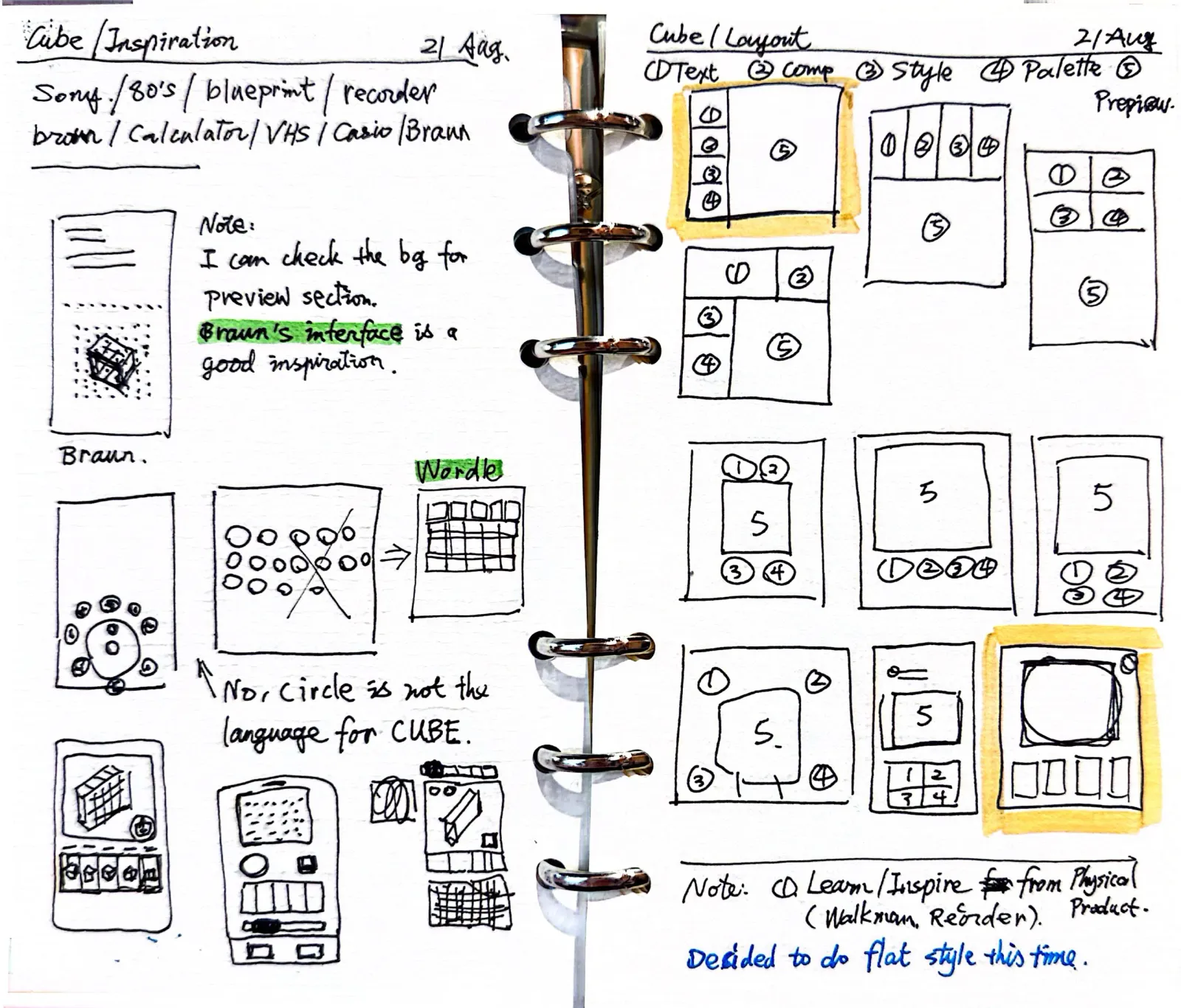
Four ideas on one page
While roaming with ideas on my notebook, I found a page with four different product ideas.
There was CUBE, of course. Then Big Type, an idea for displaying very large text, potentially useful in presentations or videos. Quote Type, for turning quotes into images. And Bubble Type.
I was exploring quite a few directions.
At one point, I considered bringing them together into a single typography tool. More features, more possibilities. It sounded appealing.
But I kept coming back to the original CUBE idea.
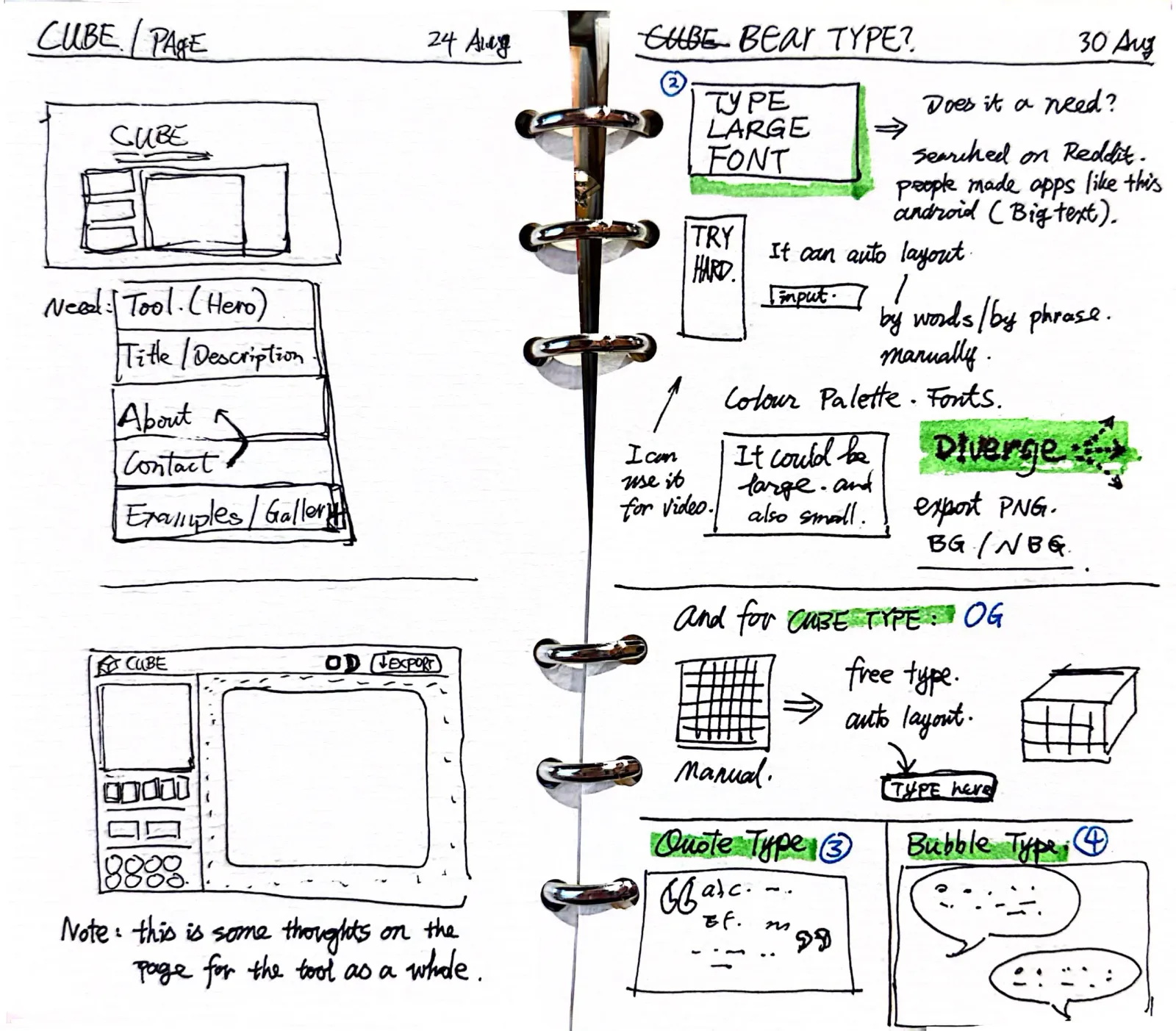
I wanted something very simple. You type a few characters and immediately see something interesting.
Even that simple interaction required a decision.
My first sketches used a grid-based text input. It looked distinctive, but I wondered whether people would understand how to use it.
Everyone already knows how to type into a text field. Why make that part complicated?
I went back to a regular text input with a character limit.
The interesting experience should come from what happens to the text, rather than how you enter it.
Eventually, I wrote down the core workflow:
Type something. Change the style. Export the result.
That became my reference whenever I was tempted to add another option.
The other typography ideas are still in my notebook. I may explore them again someday.
For CUBE, I wanted to make this one interaction work well.
The small details I cared about
Once the basic functionality was working, I started exploring the smaller interactions.
The transition between views. The hover states. The little animation when switching between light and dark mode.
Some started as rough drawings in my notebook. I'd take a photo, share it with Claude Code, explain what I wanted, and test the result.
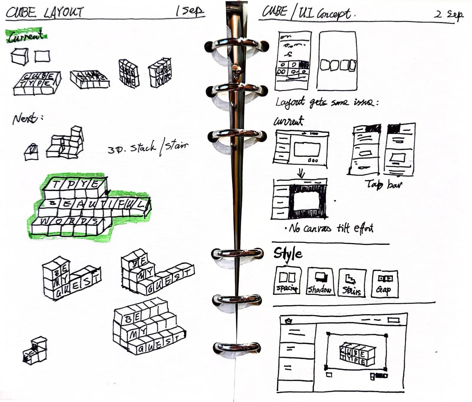
Of course, the first version was rarely perfect. Sometimes an animation felt too fast, or the movement was awkward. I'd adjust it, try again, and occasionally return to the drawing board.
I really enjoyed this process.
In my previous design jobs, I'd often create prototypes in Figma to communicate interactions. Then we'd discuss them with developers, consider the effort involved, and decide what was worth implementing.
Some details wouldn't survive that process.
Now I can experiment with them directly.
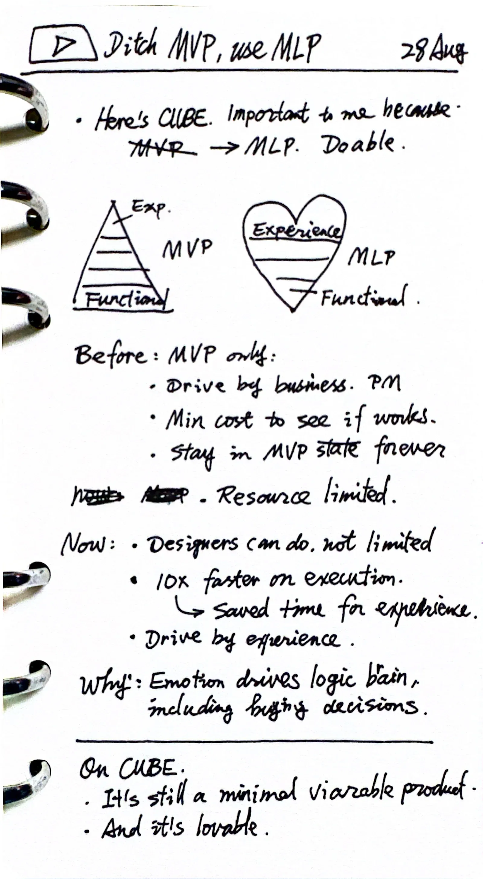
I recently revisited Jussi Pasanen's illustration of how to build a Minimum Viable Product. He proposed building a small but complete experience that considers functionality, usability and emotional design together, rather than leaving the emotional layer until everything else is finished.
Brian de Haaff, the CEO of Aha!, made a similar case back in 2013 with the idea of a Minimum Lovable Product. His analogy has stuck with me: you can survive on cat food, but you probably won't love eating it.
I think AI makes this approach much more practical.
CUBE doesn't solve an urgent problem. People can live perfectly happy lives without a 3D typography generator.
So the experience itself matters. If it isn't enjoyable to play with, why would anyone spend time on it?
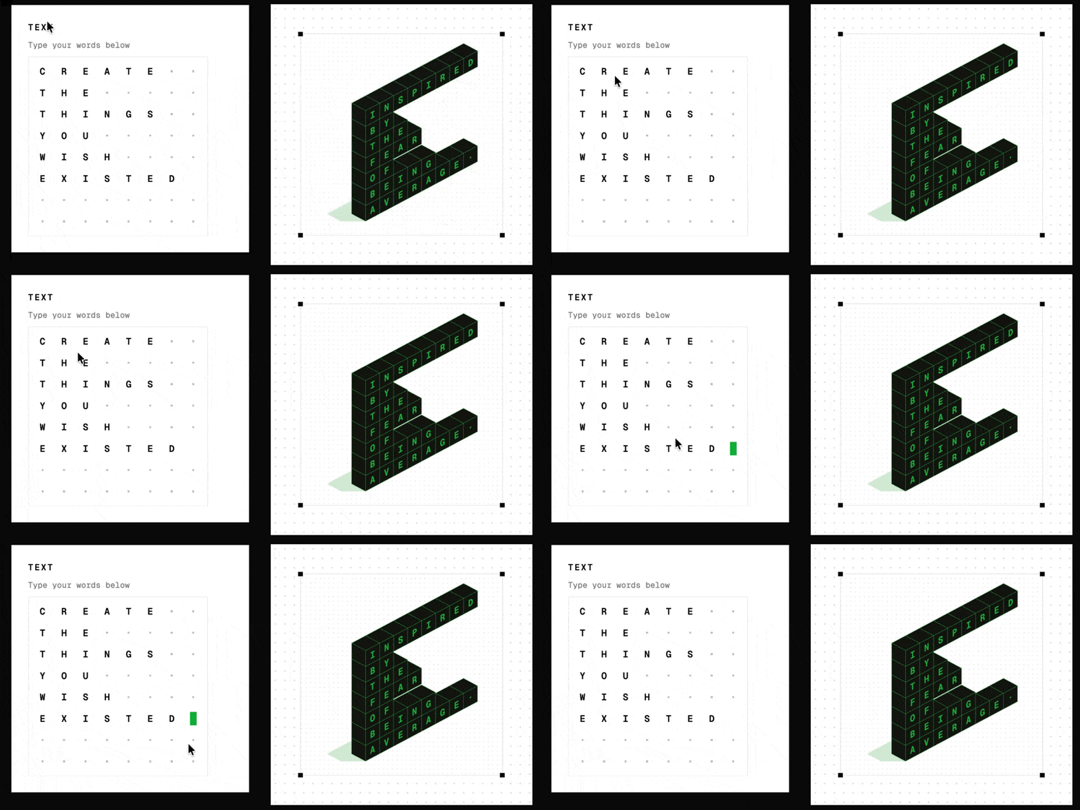
That doesn't mean every product needs fancy animations. Sometimes removing an unnecessary interaction is just as valuable as adding a nice one.
What's changed for me is that I can explore these decisions through a working product, rather than relying entirely on static designs or prototypes.
Three words, but do they mean anything?
Early in development, I wrote down three things I wanted CUBE to be.
Effortless. Shareable. Playful.
I know. These sound like the kind of words you'd see in hundreds of design presentations.
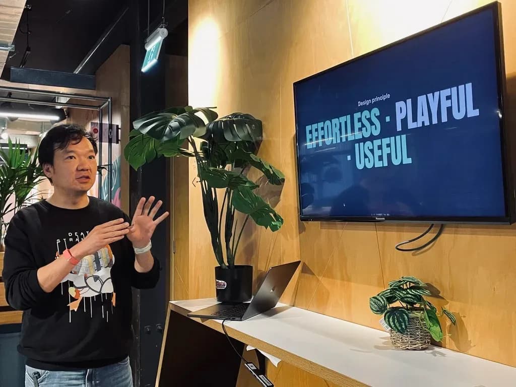
So I tried to make them more useful.
For effortless, I wanted to know whether visitors could start using the tool without much effort. One useful signal would be how many people actually started typing.
For shareable, I could look at whether people exported their creations and whether the sharing feature encouraged other people to visit.
Playful was harder.
I could observe whether people tried different styles or created multiple designs. But those numbers wouldn't tell me everything.
Someone might explore ten styles because they're having fun. Or because they can't find one they like.
That's where watching people use the product, listening to feedback, and making design judgments still matter.
I think it's useful to distinguish between what we can measure and what we need to understand through observation.
Analytics can tell me how many people exported a file. They can't tell me whether someone loved the result, used it in a presentation, or felt disappointed after downloading it.
For a small creative tool like CUBE, those questions matter quite a lot.
And once I launched it, I finally had some real behaviour to look at.
Part 2: What happened after launch
People tried it, but did they find it useful?
CUBE went live on September 9.
I shared it on social media, mentioned it to friends, and sent it to a few people who might be interested.
I also started looking at the analytics.
In the first 30 days, around 1,200 people visited CUBE.
About half of them typed something. But only 81 people exported at least one file.
Those 81 people downloaded more than 200 files in total.
Initially, I was pleased to see people trying the tool.
But when I looked more closely, only about 7% of visitors actually took something away.
That made me revisit those three design principles.
Getting people to start seemed relatively easy. Getting them to make something they wanted to keep was another matter.
The sharing feature was even less successful.
People generated 25 sharing links. Those links brought in five visitors, and none of them exported anything.
I'd imagined people making something fun, sharing it with friends, and bringing more users into CUBE.
Well, that didn't really happen.
Maybe people didn't feel their creations were worth sharing. Maybe the sharing interaction wasn't obvious enough. Or maybe the tool simply isn't something people naturally recommend to their friends.
I don't know yet.
But those numbers gave me something more specific to investigate.
A conversation changed how I saw the product
Around this time, I was showing CUBE to a few founders in person.
That's when someone pointed out the problem with their brand colour.
It was a simple observation, but it revealed something I'd overlooked.
I'd been thinking about CUBE as a creative toy. People could use it to make interesting typography, experiment with different styles, and perhaps put the result in a presentation or social post.
These founders were thinking about an actual job they needed to do.
They wanted marketing graphics for their products and services.
And marketing graphics need to work with existing brand colours, typography and other assets.
I added a colour picker as a result.
I'm careful about drawing big conclusions from two conversations. Someone saying they'd pay for something is encouraging, but it doesn't mean you've found a market.
Still, it was a useful reminder.
I'd spent a lot of time deciding what the product should be. Now I was starting to see what other people wanted it to become.
People started finding CUBE in unexpected places
One thing I've been learning about launching products is that distribution takes quite a lot of work.
I can share something on LinkedIn or X, and people will visit.
But the traffic usually drops soon after I stop posting.
I also don't want to keep asking the same people to try my latest project. Every message takes a little of their attention and goodwill.
So I was pleasantly surprised when CUBE started appearing in places I hadn't contacted.
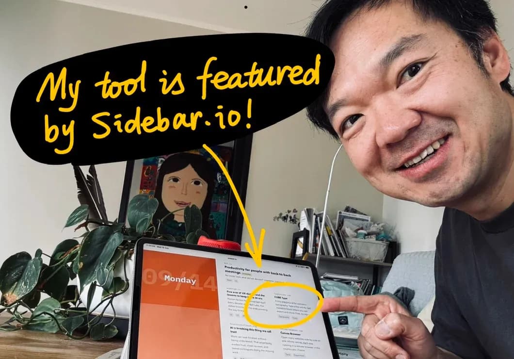
First, Sidebar, a design newsletter, featured it on September 14.
That brought 354 visitors in one day. Quite a lot for a small side project.
Then I discovered a German review on Dr. Web.
The article, written by Markus Seyfferth, included the observation that CUBE could save someone half an hour of work in Illustrator.
But the review also pointed out a practical limitation: CUBE couldn't export SVG files.
PNG was fine for a quick image, but professional design work often needs vector graphics, especially for branding and print.
Fair point.
A few other people had independently requested SVG export too.
It's interesting how a product can look complete from the creator's perspective, while someone else immediately sees a missing feature.
And the feedback was particularly useful because it came from an actual use case.
My favourite discovery
This one is probably my favourite.
Someone saved CUBE to Pinboard, the bookmarking service.
Then Joe Jenett discovered it and added it to his iwebthings collection.
From there, Sarah Honeychurch found it and turned CUBE into a Daily Create challenge for ds106, an open digital storytelling community.
The task was simple: use CUBE to make something creative.
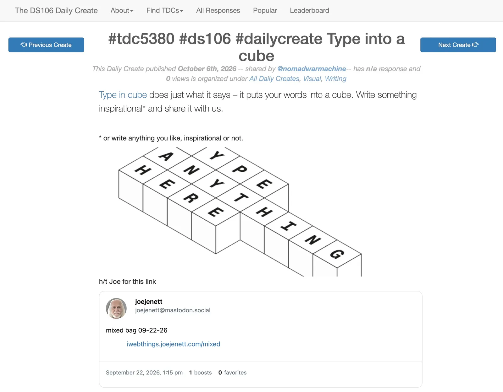
Four people I'd never met made their own artwork and shared it.
I discovered this afterwards, while looking through referral traffic.
I had spent no time promoting CUBE to that community. I didn't even know it existed.
Yet somehow, the tool had found its way there.
It reminded me of the old web, when people found interesting websites through blogs, personal bookmarks, and recommendations from other people.
There's something worth exploring here.
Those people had a specific reason to use CUBE. Someone had given them a creative challenge.
They weren't simply visiting another website out of curiosity.
I don't know how repeatable this is, but perhaps helping people find a reason to use a tool is just as important as helping them discover it.
Then Hacker News happened
On October 10, someone I didn't know submitted CUBE to Hacker News.
I hadn't planned it or asked them to do it.
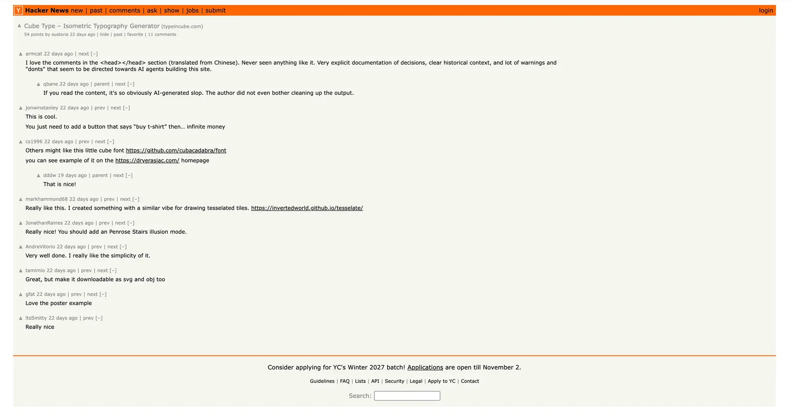
The post reached the front page, with 54 points and around ten comments.
Over the next two days, around 2,600 people visited CUBE.
That's more than twice the traffic from its entire first month.
Pretty exciting, right?
But when I looked at the exports, only about 60 people had downloaded anything.
So the traffic was impressive, but most visitors didn't go very far.
That doesn't mean Hacker News was a bad channel. Plenty of people discovered CUBE, and some may return later.
But it made me think about how different visitors behave depending on where they come from.
Someone browsing Hacker News might just be curious about what a designer has built with AI.
Someone taking part in a creative challenge already has a reason to make something.
They're both valuable, but they arrive with different intentions.
And I probably shouldn't evaluate them in exactly the same way.
A little mystery from Spain
One more thing I noticed in the analytics.
On October 15, there was a strange cluster of activity from A Coruña, Spain.
Over 47 minutes, 16 people visited CUBE, all from Windows desktop computers.
Twelve of them exported 22 files.
That's an unusually high proportion compared with the rest of my traffic.
My guess is that someone might have been using CUBE in a classroom or workshop.
Maybe a teacher discovered it and asked students to create something.
I have no evidence beyond the analytics, so this is just a guess.
But I love imagining that somewhere in Spain, a group of people were experimenting with something I made in Auckland.
The internet is still pretty wonderful sometimes.
Two different things I'm learning
Looking back, I feel like I've been running two experiments through one little project.
The first was about design and AI.
As a designer, I can now move from an idea in my notebook to a working product with much less friction.
I can test interactions, experiment with visual details, and make changes directly.
But I also have to be more careful about deciding what deserves to be built.
AI is very willing to implement whatever I ask. It doesn't know whether another feature makes the product better, whether two visual styles belong together, or whether a clever interaction is unnecessarily complicated.
Those are decisions I still need to make.
The second experiment started when I put CUBE in front of people.
I've spent much of my career designing digital products. I'm comfortable thinking about interfaces, interactions and user experience.
Finding customers and building distribution channels is something I'm still learning.
I don't have a growth playbook to share.
What I have so far is a collection of observations.
Personal promotion brings visitors, but needs continuous effort. Curators can introduce a product to people I wouldn't reach myself. Communities sometimes discover uses I hadn't considered. And a lot of traffic doesn't necessarily mean a lot of people getting value.
The founder who wanted their own brand colour, the reviewer who needed SVG, and the people who used CUBE for a creative challenge all showed me different possibilities.
I want to explore those further, especially with designers, educators and people creating marketing content.
Maybe some of these directions will work. Maybe none of them will.
I'm enjoying the process of finding out.
One thing has become clearer to me, though.
Building with AI gives me more freedom to experiment with ideas. Publishing those ideas gives other people the opportunity to challenge my assumptions.
I need both.
CUBE is still available if you'd like to give it a try.
I also recorded a video walkthrough: the making of CUBE, including the early sketches and some of the interactions I built with Claude Code.
And if you're also building something with AI, I'd love to hear about your experience. What has surprised you most, either while making the product or after putting it in front of users?